SNS
Redesigning the concept for a banking website
SNS was in need of a rebranding of their commerce and app concepts, and asked Mirabeau to help them create a user-friendly style that showed the message behind SNS bank.
GOAL
Create a cohesive and scalable banking experience within the SNS digital eco-system, that fits the users state-of-mind at any time in their journey.
OUTCOME
A responsive platform guiding users through their journey and aiding their process of becoming and staying an SNS customer.
MY ROLE
UX design, Interaction design, Stakeholder management, User research, UX content
COMPANY
Mirabeau
The project
In this project, I was part of the team that re-designed the SNS website. Together with the team, I designed a completely new website concept in a long-running SCRUM project. The project was split into various business silos that all needed to fit within the overarching concept, but were designed and specified individually.
As a side project, I also helped redesign the new concept for the Mijn SNS banking environment. During this process, the goal was to create a more user-friendly banking experience that was tailored to actual user needs and tasks. This project is currently being developed.
Design process
As the lead interaction designer on the project, I was in charge of gathering requirements from stakeholders and users. I worked in close collaboration with the product owner and business analyst to get the right input for the project. I made sure these requirements were translated into a clear user experience.
To visualize stakeholder needs in relation to user needs, I created various experience maps and customer journeys. These helped stakeholders understand the starting point and direction for the design.
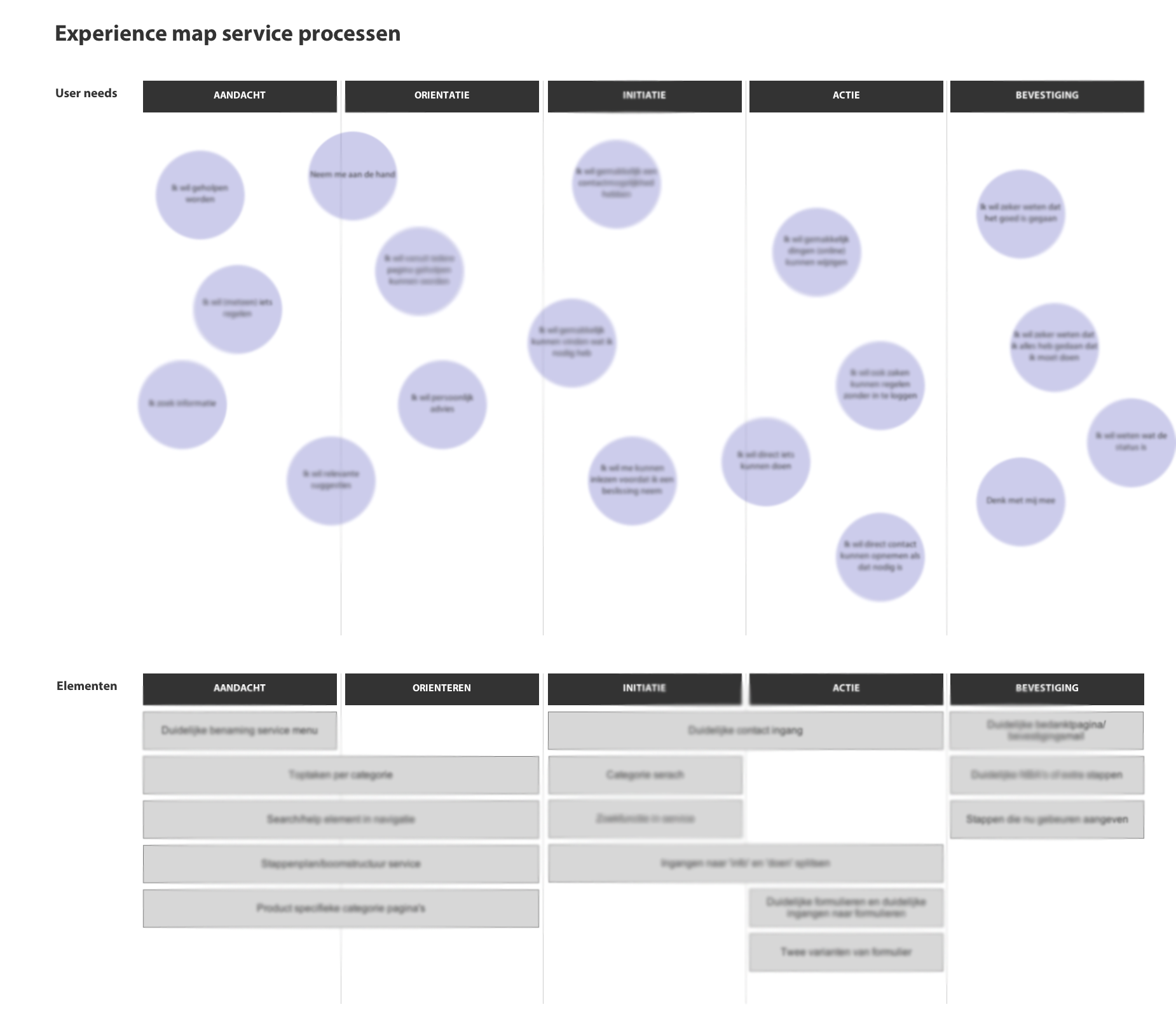
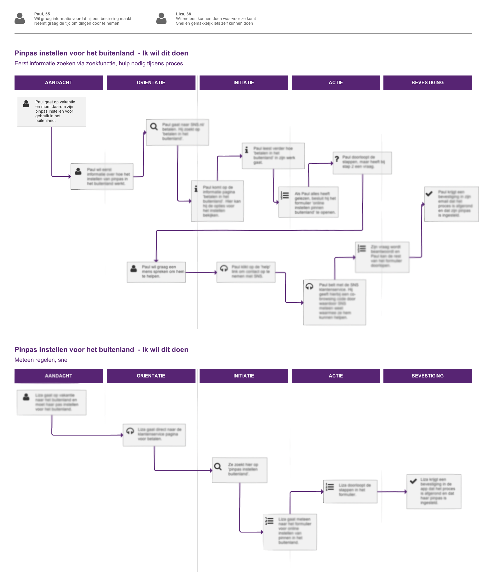
I also helped structure and detail out the user stories provided by the stakeholders. Together with the product owner we decided on a valid number of user stories to focus on for the first designs.
For each user story, I created UX designs, varying from priority guides to extensive wireframes including technical details. These were meant to help the development team understand the specific interaction patterns, and build upon the components in an agile way. The concept was used as a guideline to make UX and design decisions along the way.
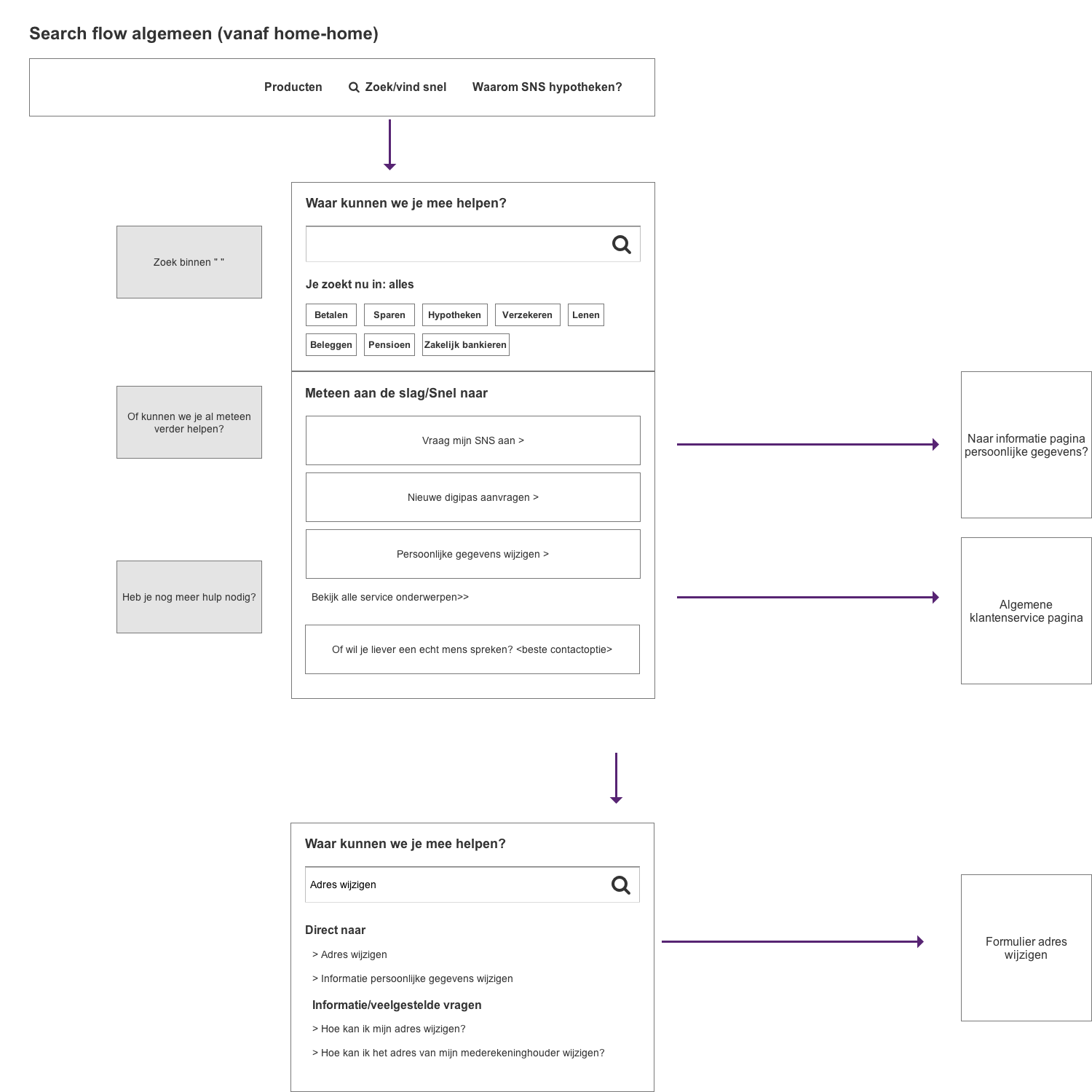
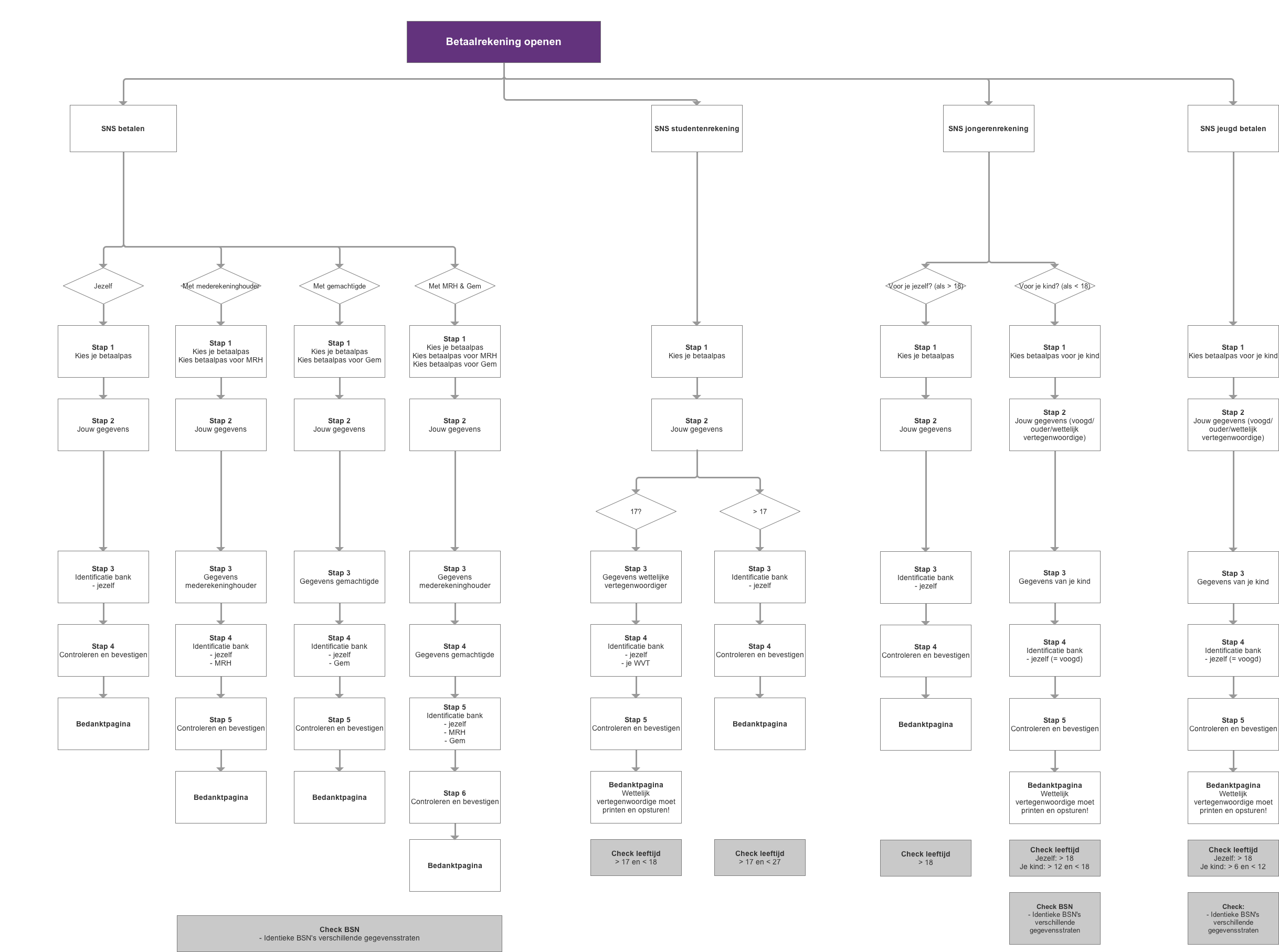
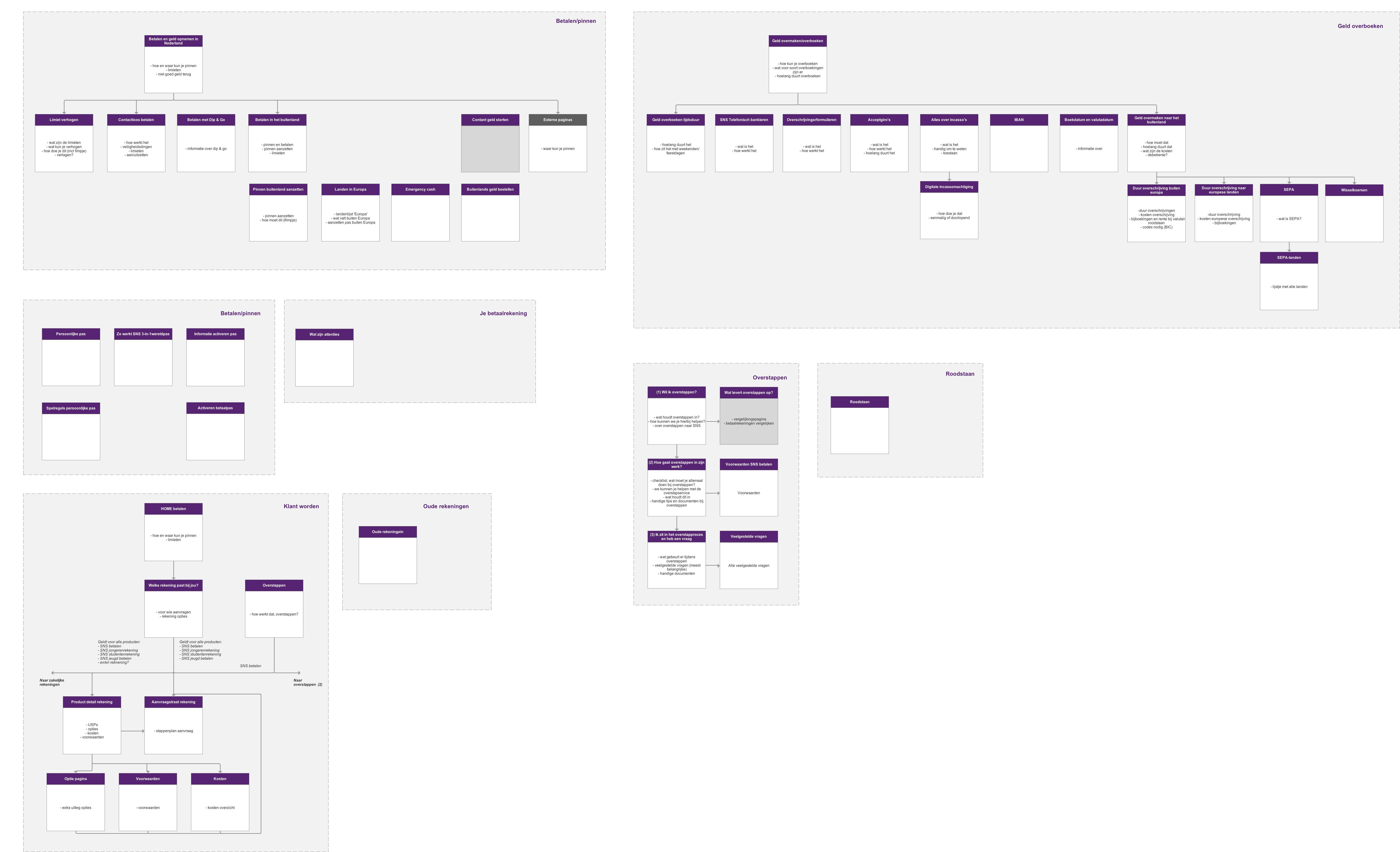
Due to the large content base for the website, I also helped the content team explore new ways to get the story across to the user. I made various content mappings and hierarchies and provided the content team with input.
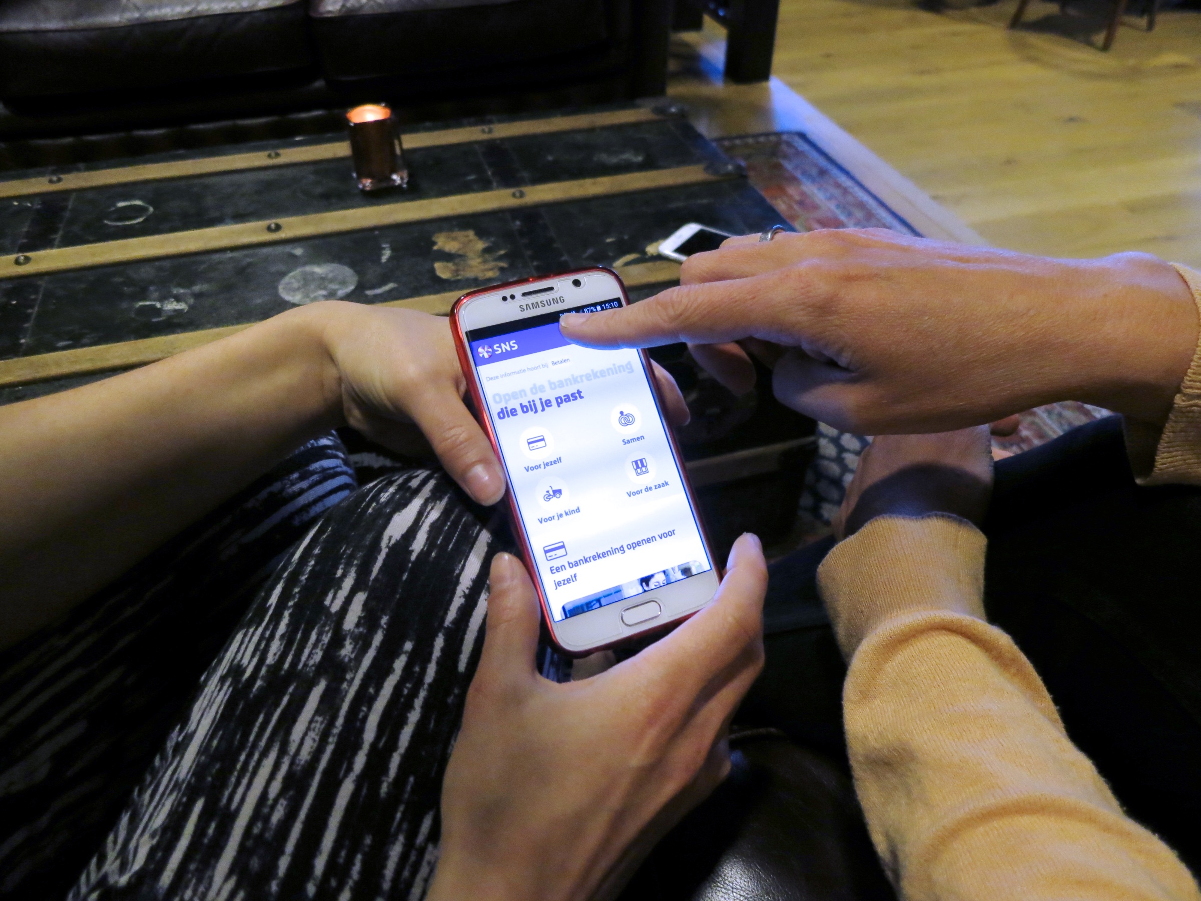
During the project, I also worked in close collaboration with the visual designer and developers to translate the user experience and concept principles into the actual design and working application. I also performed various user tests (formal and informal) to get quick feedback on new paradigms and help iterate on the concept and designs on the go.
The result
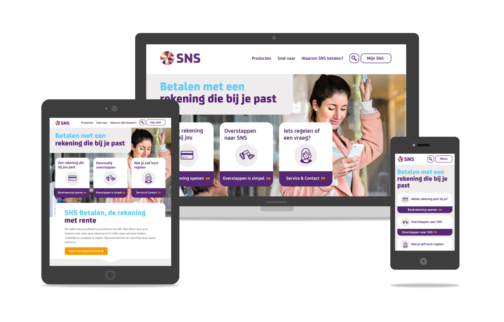
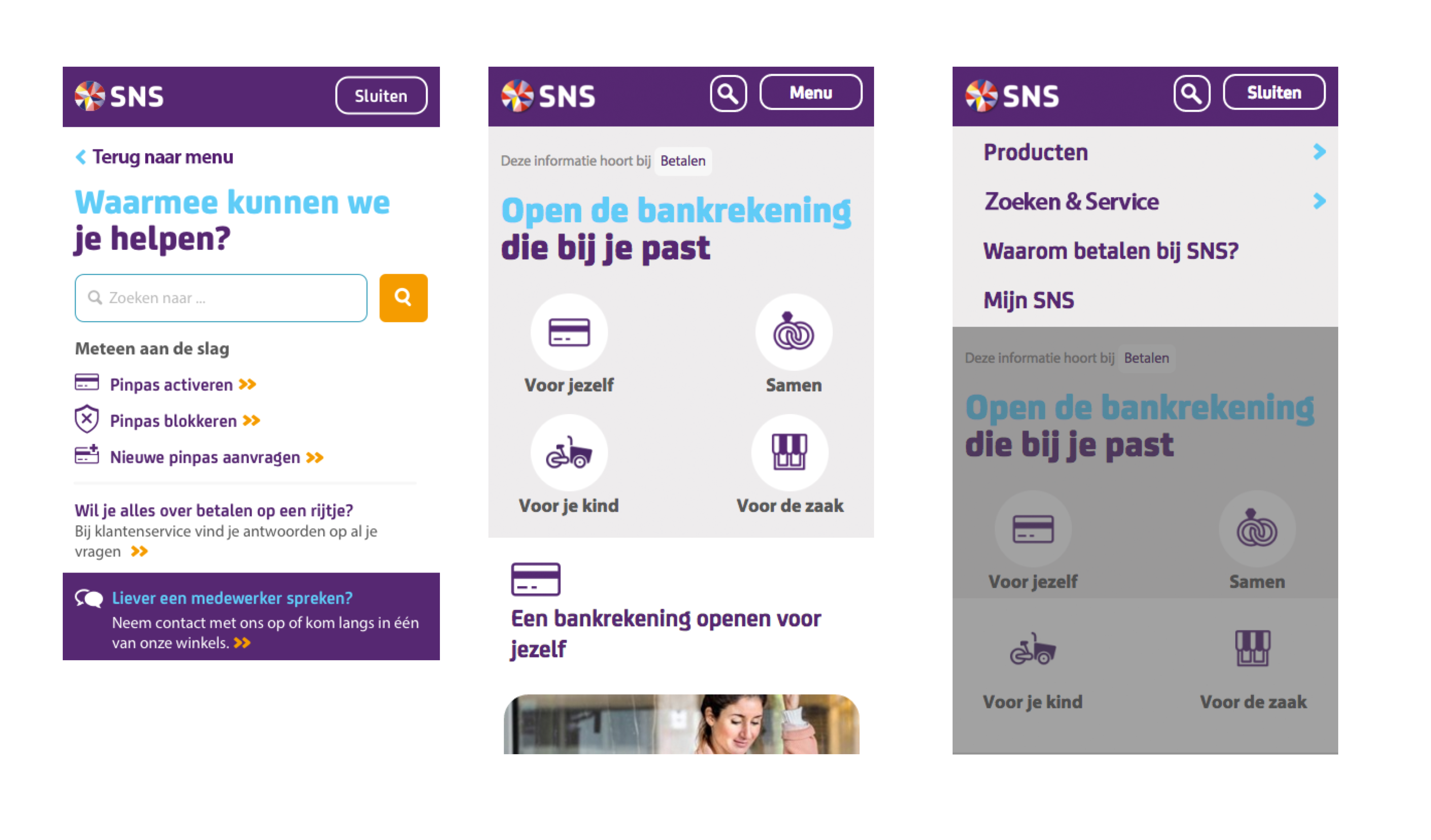
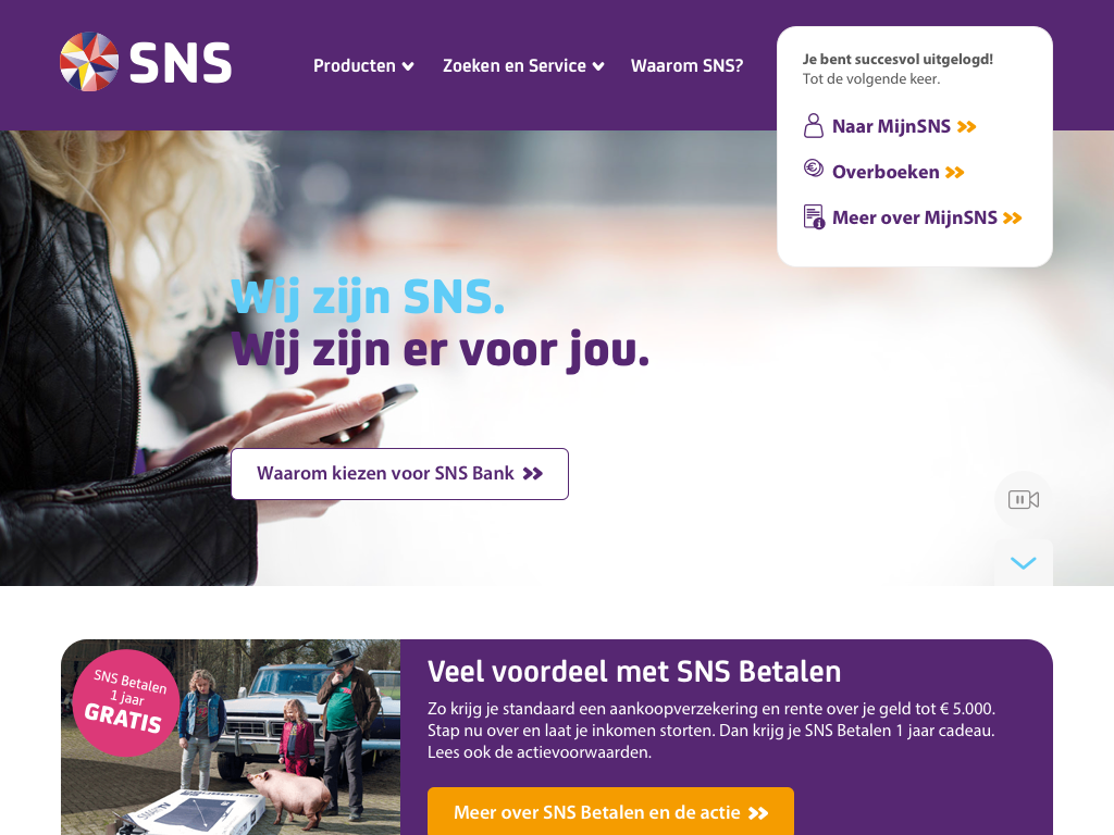
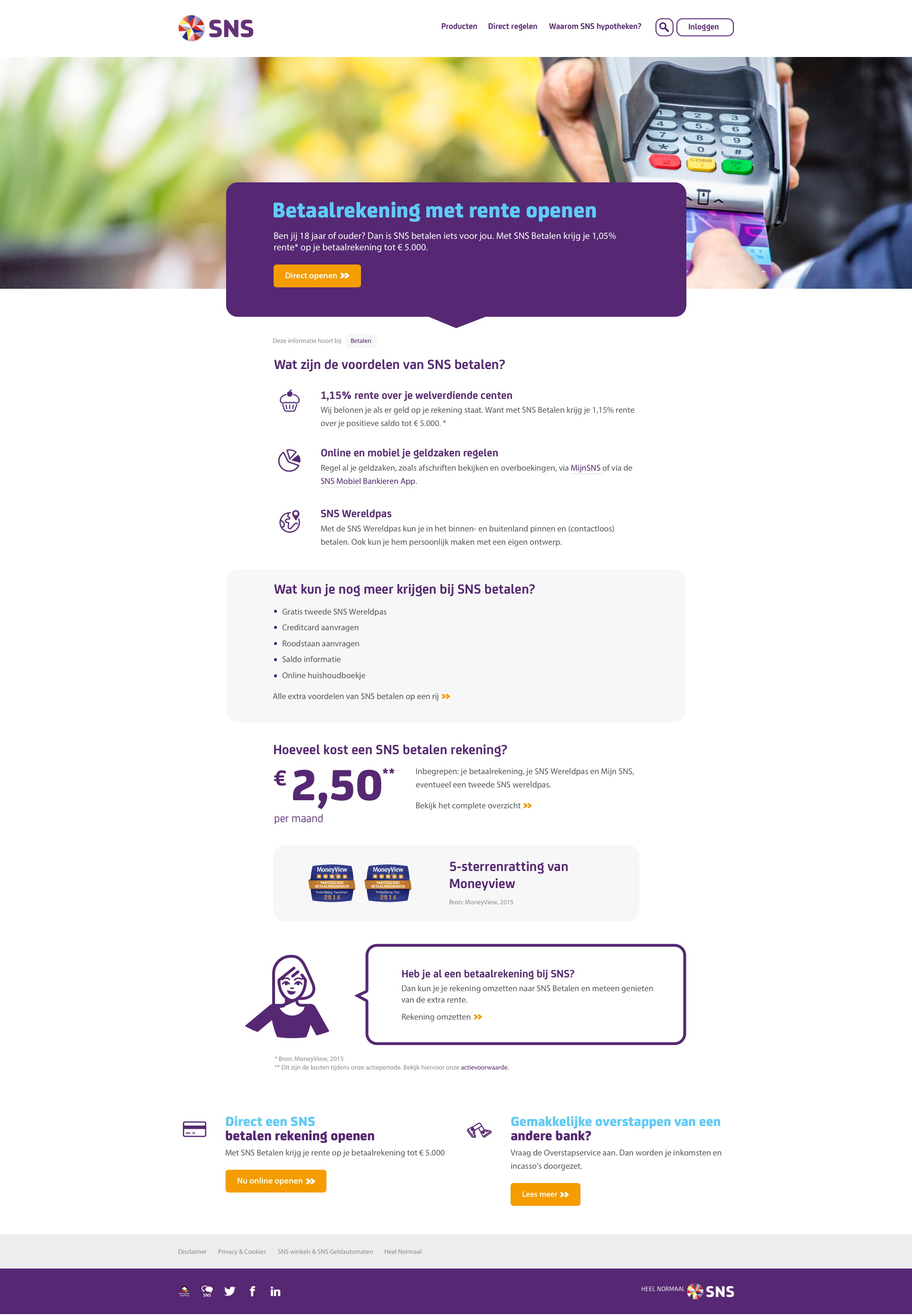
During this project we focused on the major business silos Betalen, Hypotheken and Service, and redesigned the home page. The end result was a user-friendly, open and robust new concept that allows users to easily see what SNS stands for, and shows the true face of SNS. We provided SNS with guidelines to implement other silos and components in the future.
My activities
- Creating & detailing the new website concept
- Leading stakeholder meetings to gather requirements
- Creating understandable user experience & interaction patterns
- Designing user flows & technical flows for new and existing services
- Creating content flows together with the content writers
- Communicating designs & ideas to the development team
- Performing various types of user research to verify the design