QC OnE | Service concept
Re-imagining the inspection process of fresh produce
QC one is a quality control company that provides a platform for their clients to inspect fresh produce and report findings throughout the supply chain. Currently, providing support for their clients takes a lot of time and inhibits business growth.
GOAL
Create a pro-active self-service platform that allows clients to easily manage their own setup and business processes.
OUTCOME
A digital concept that maps the user’s process, simplifying the service and allowing users to easily and efficiently set-up and manage their processes.
my role
Lead UX, UX/UI design, Service design, User research, Concept design
COMPANY
Sping
The project
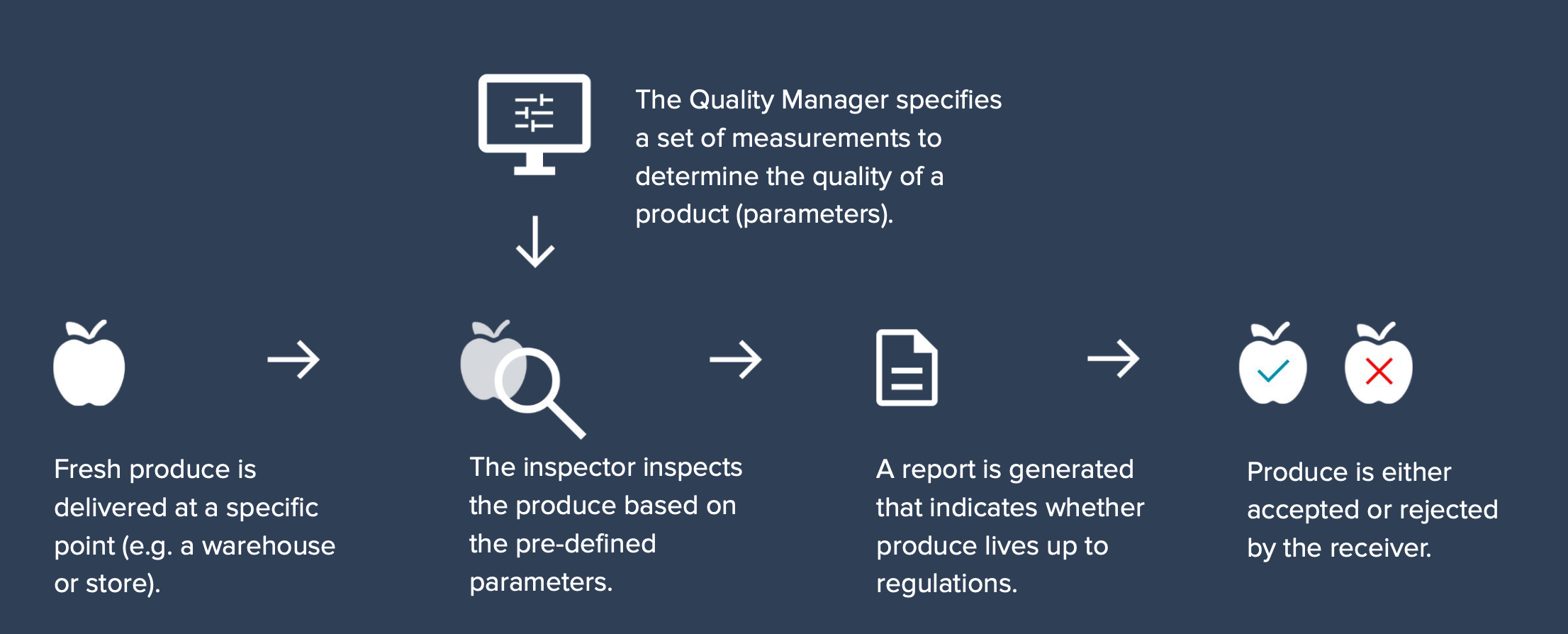
The service of QC One aids inspectors of various organisations in inspecting fresh produce based on pre-defined specifications (parameters). These are set by the Quality Manager of an organisation, based on requirements of all parties involved. The produce is inspected during multiple moments in the product life cycle (for example, upon arrival in the warehouse). A report is generated to show if and how the product lives up to the regulations. This service allows organisations to validate the quality of their purchased produce.
I was the lead designer on this project, and responsible for unravelling the complexity of the QC One service, and shaping a service redesign backed up by a clear product strategy that addresses the underlying issues.
Service exploration
I had multiple co-creation sessions with QC One, in which we explored the current system design and their business strategy. I used methods such as Business Model Canvas and our own Product Vision template, complemented by a deep dive into the clients of QC One and their needs. This helped me get a better understanding of the core structure of their service and digital landscape, and how their clients integrate this application in their daily work.
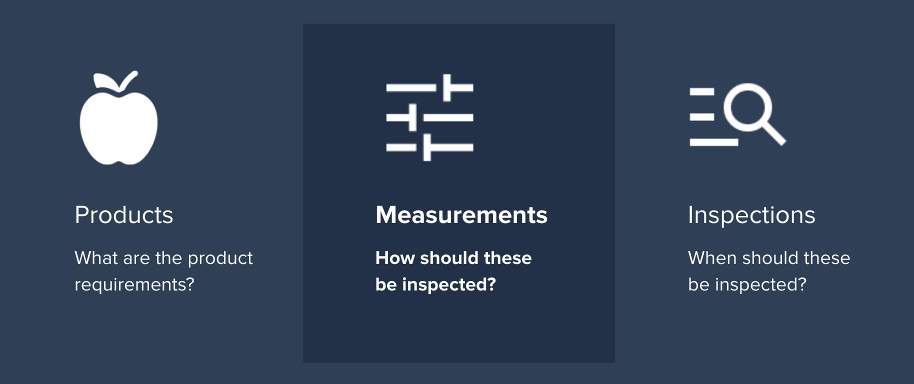
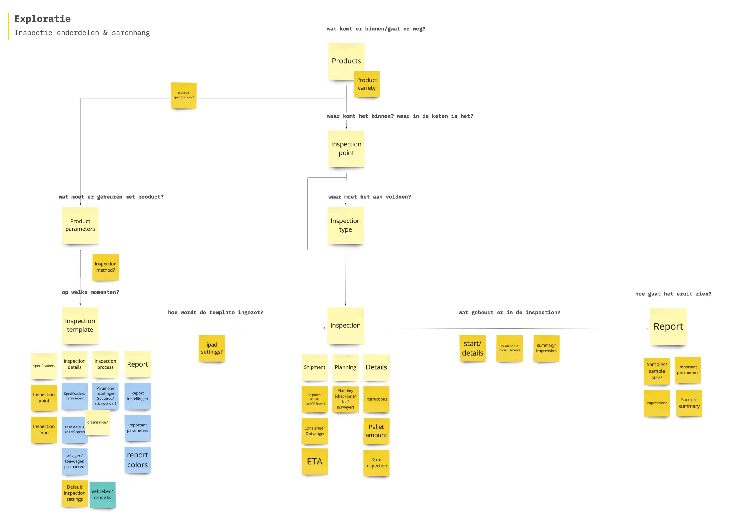
What became clear is that the system and overall service of QC One can be divided into three building blocks; products & specifications, measurements and inspections.
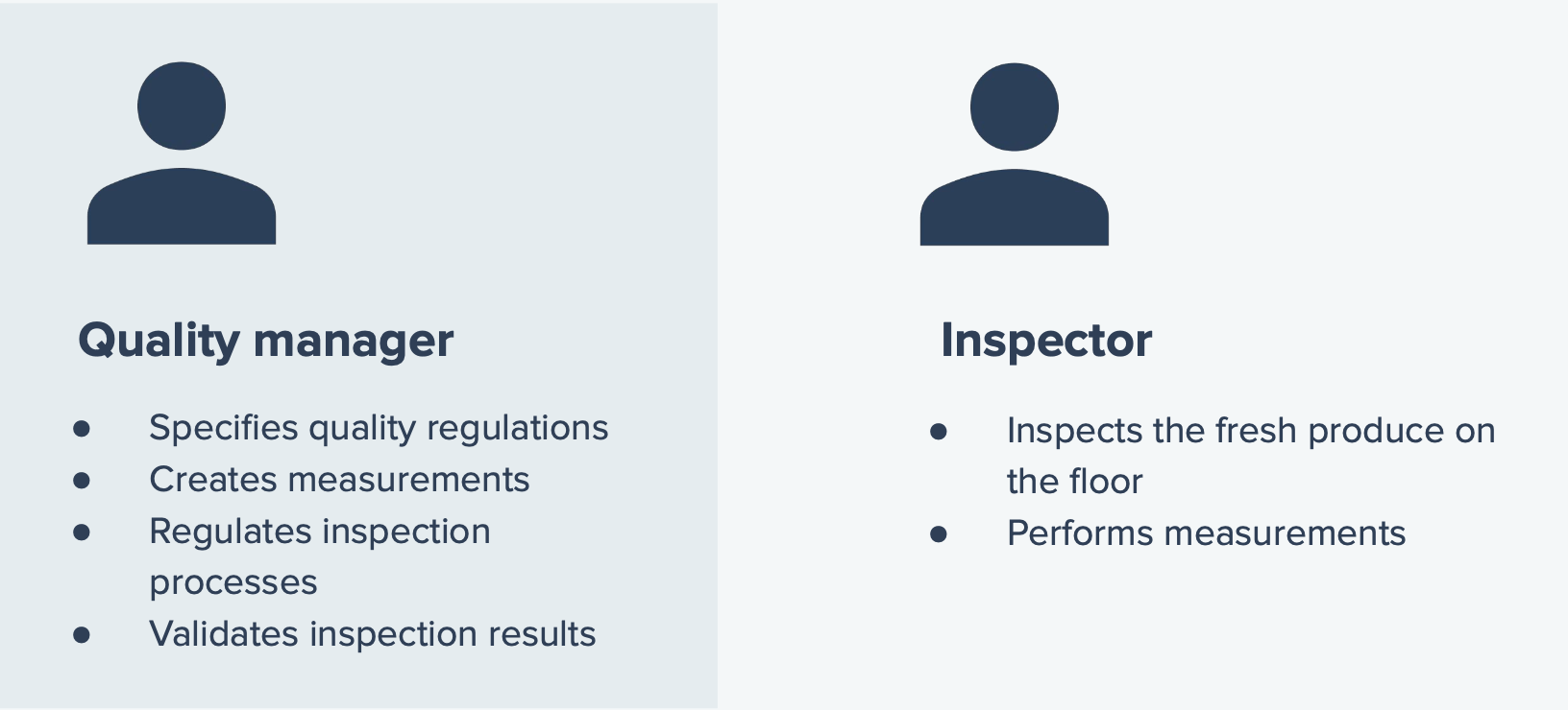
Also, there are two main target groups for the system, that use different parts of the system: the Quality Manager and the Inspector. While the Quality Manager decides on the correct measurements for each product and specifies these in the system, the Inspector actually performs inspections to verify if products adhere to the measurements.
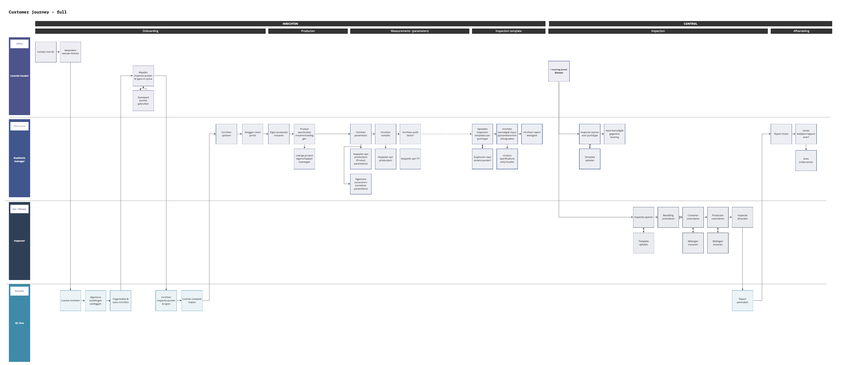
Depending on the user’s role, they navigate one or more of these building blocks as part of their overal customer journey.
However, in the current system design, these building blocks have become intertwined. This leads to inconsistencies between the digital journey and the actual inspection proces, making the experience unclear and confusing.
In order to align both journeys, I devised a plan to cluster and unravel these buildings blocks in a logical way.
Service Design
In sessions with QC One, we also discussed and refined how they wanted their service to evolve. The core service vision of QC One was: ‘creating a self-service environment’, that would allow users to create their own digital inspection set-up.
This vision became the main focus for this project, and guided our decisions going forward. Based on this, I identified three areas of improvement that would contribute to this service vision:

System design
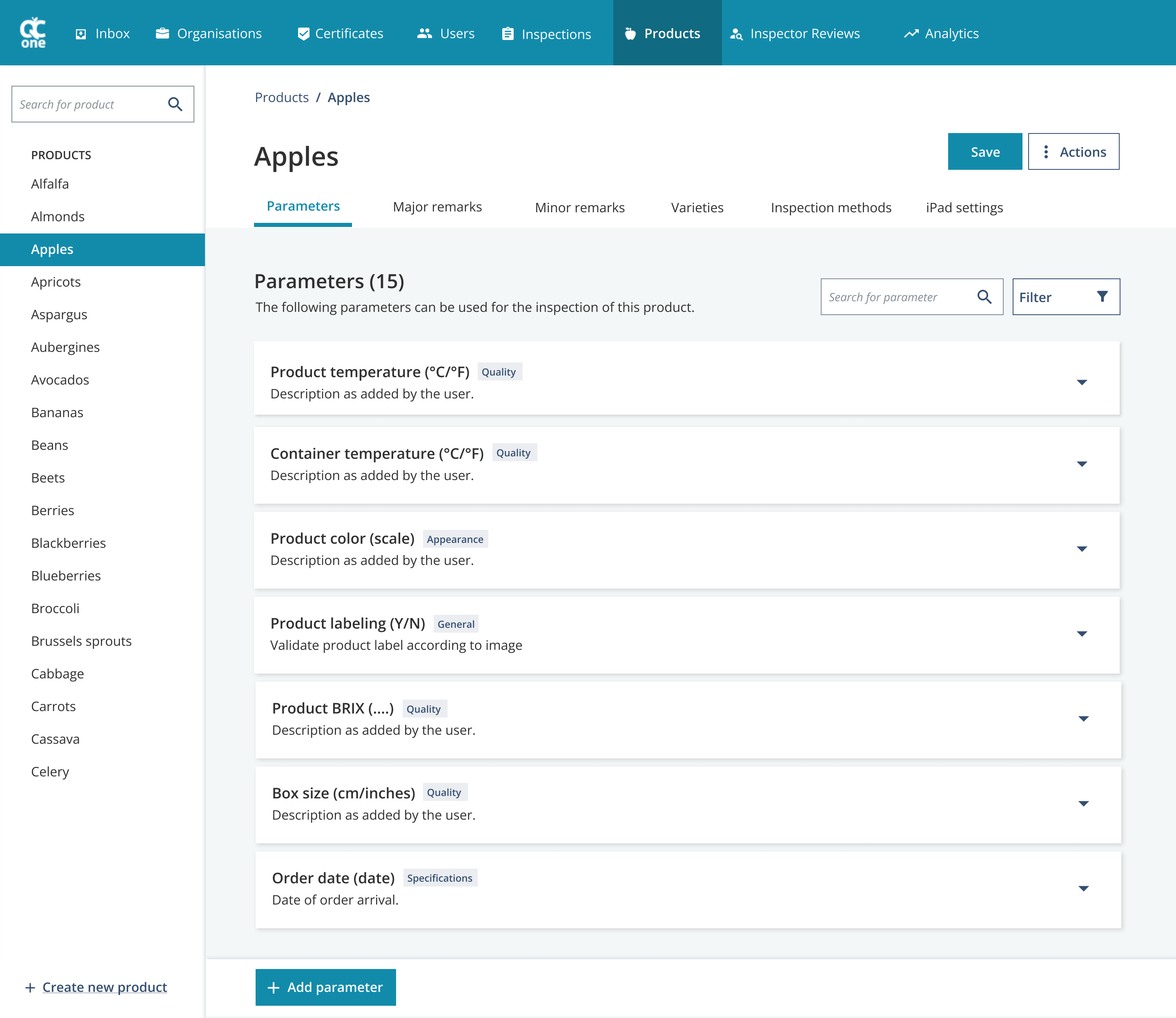
After our alignment on this service strategy, the first part of the project focussed on the building block ‘measurements’ (or parameters). These determine how a product should be inspected at any given point. Currently, only QC One Administrators can create and add parameters to products, based on input they get from their clients.
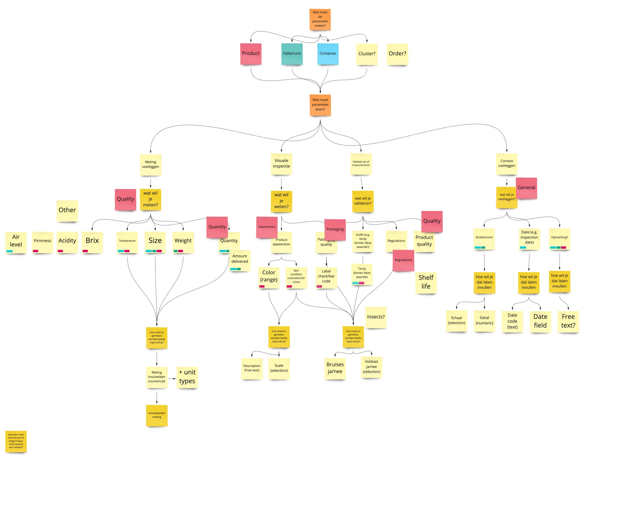
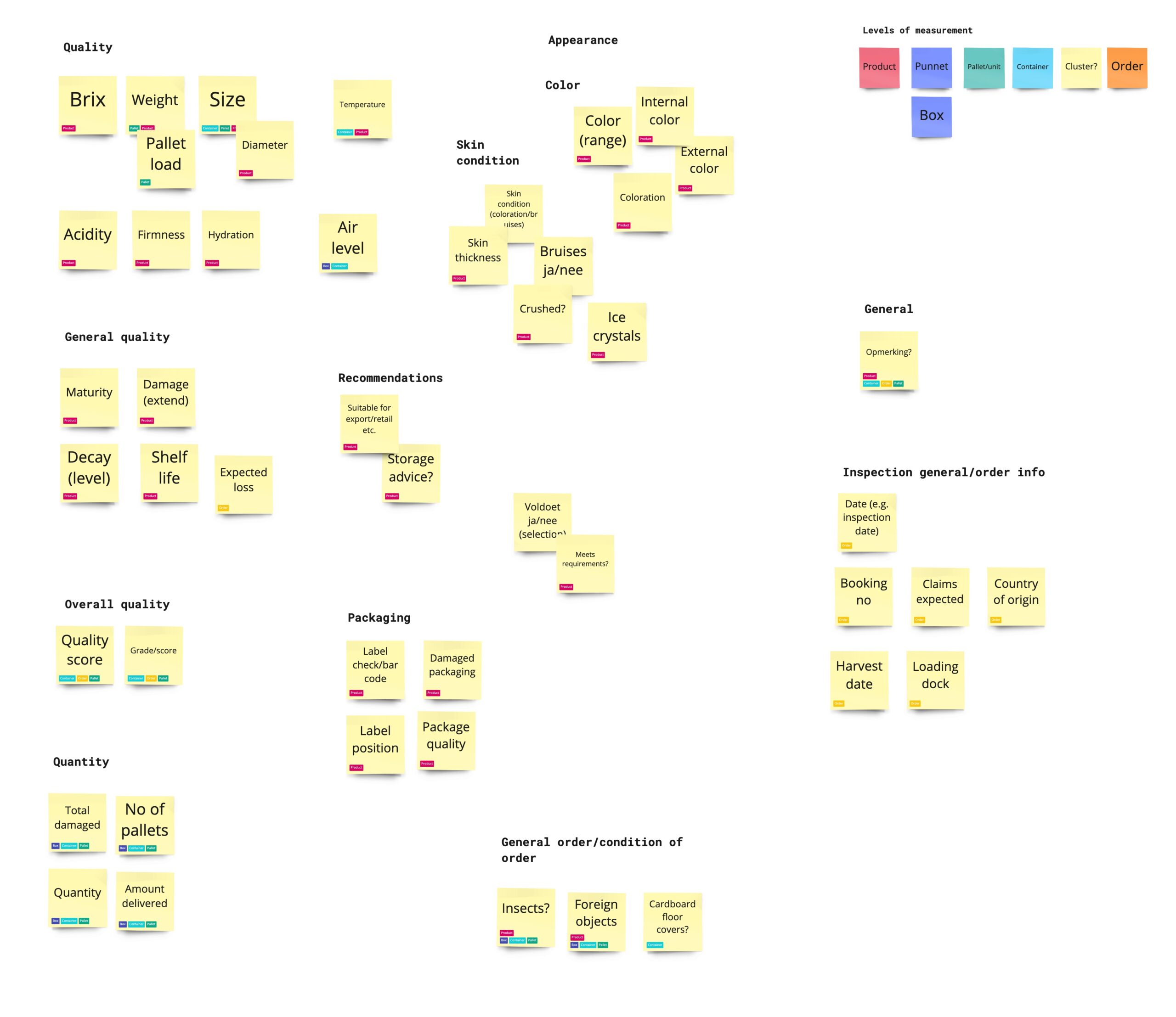
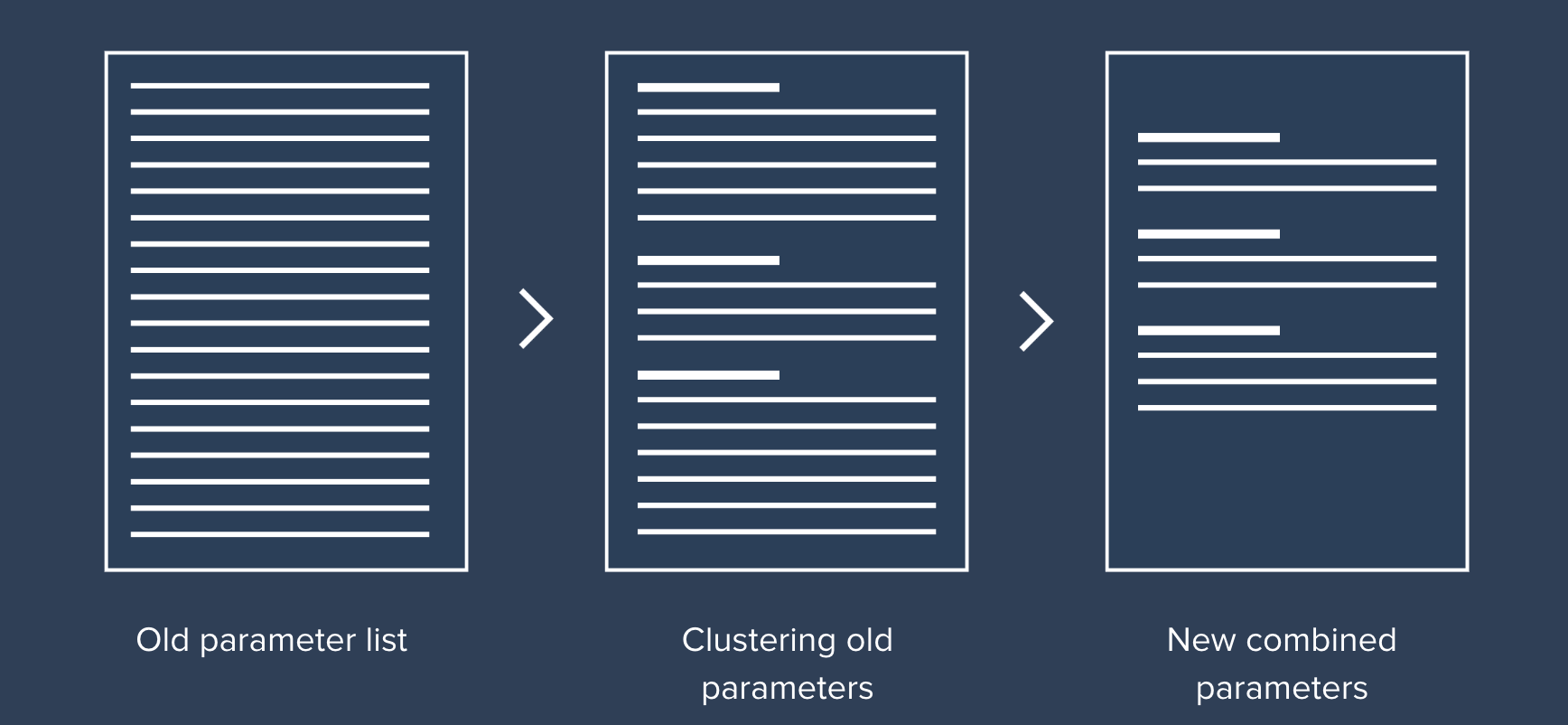
In order to fit into a self-service environment, the process of adding and interacting with parameters in the system would have to be simplified greatly and connected with the actual inspection process. The current proces requires a complex and multi-layered process that is time-consuming and not intuitive. Moreover, due to this complexity, a multitude of individual measurements is created in the system. The first step towards a new process was to investigate and cluster the existing parameters.
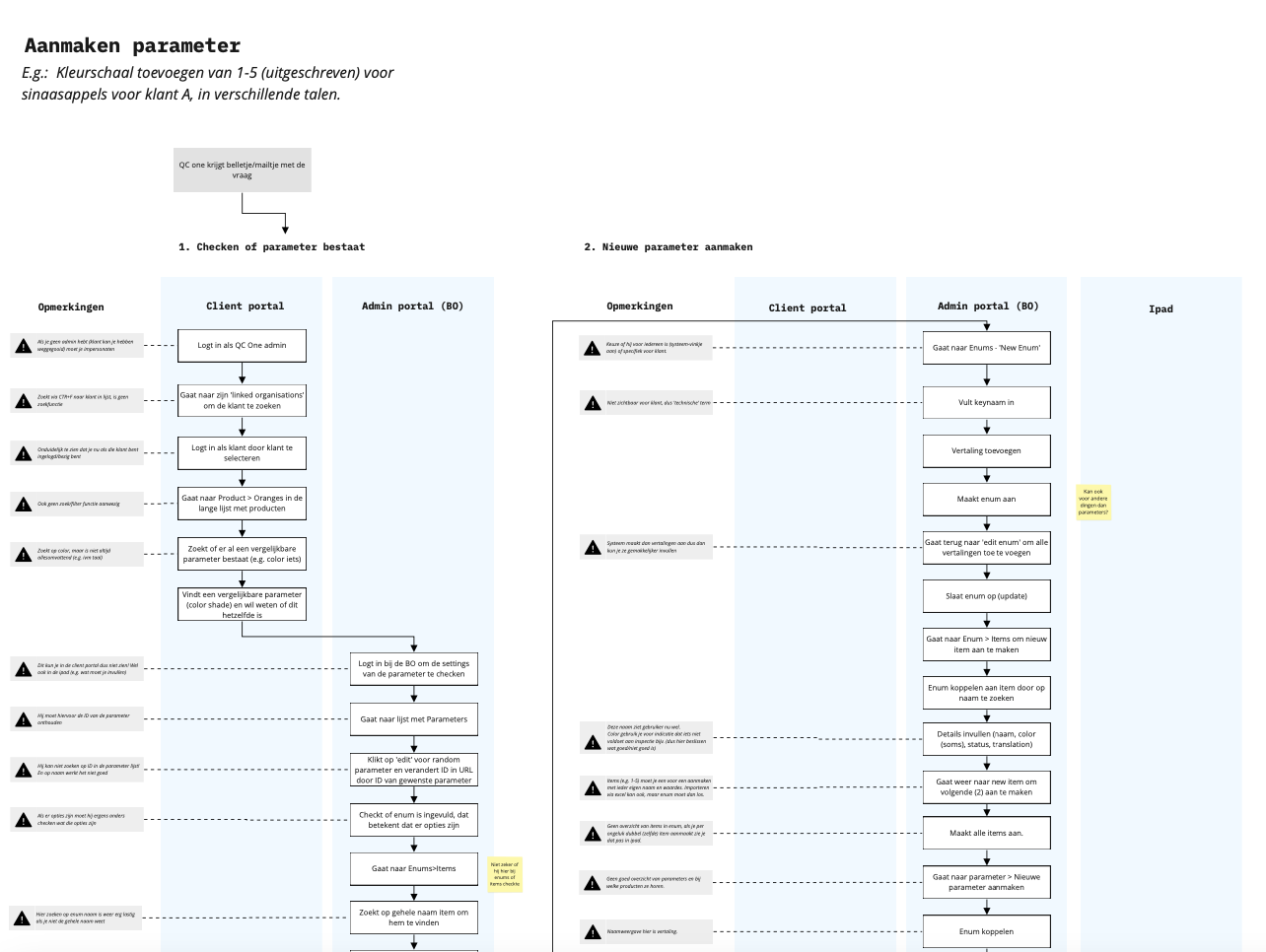
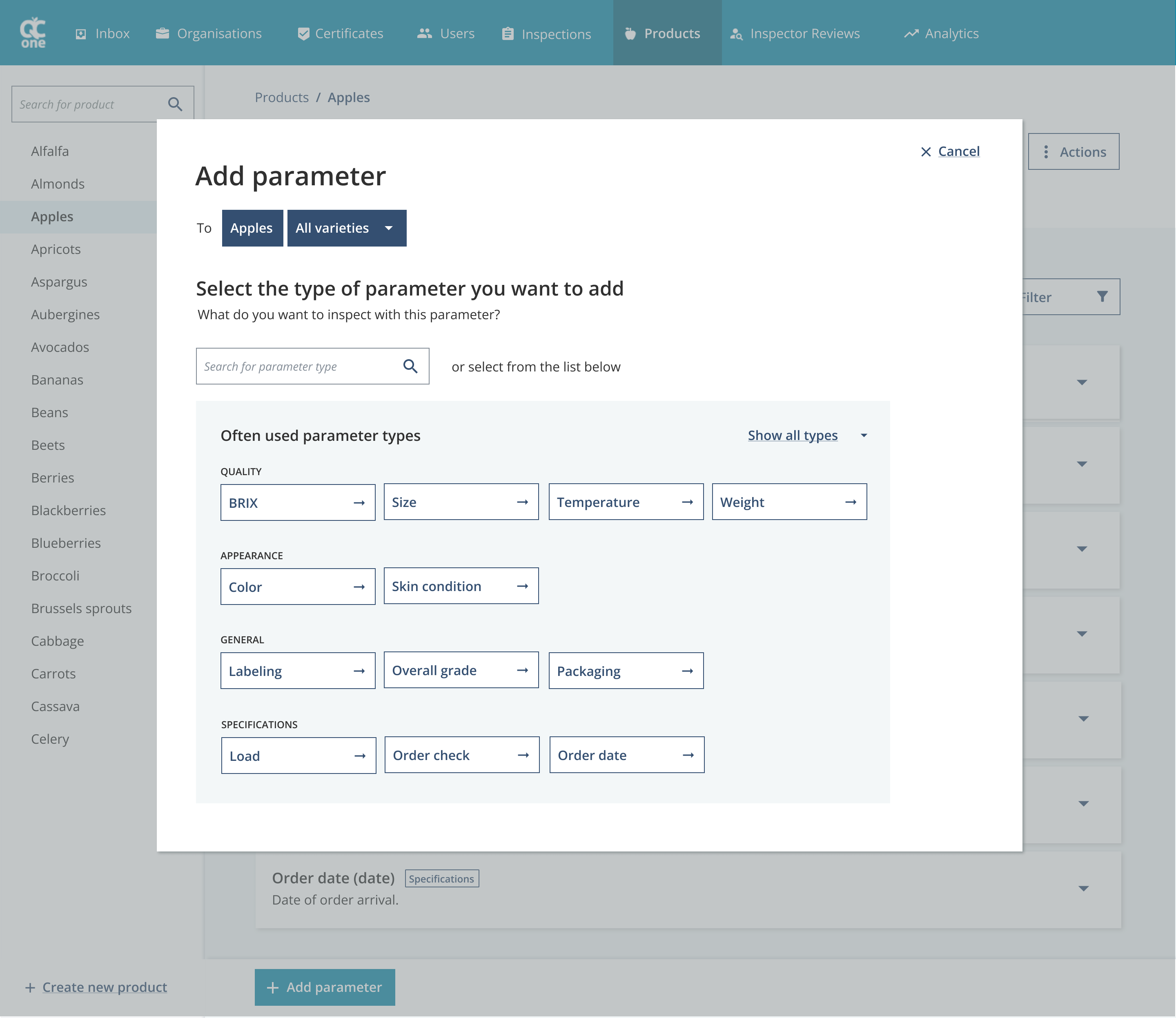
This created a standardized list of parameters that can be implemented across products. The approach minimized the multitude of possible variations, making it easier for users to find the required parameter and prevent future sprawl. These exploration were discussed and fine-tuned together with QC One.
UX Design
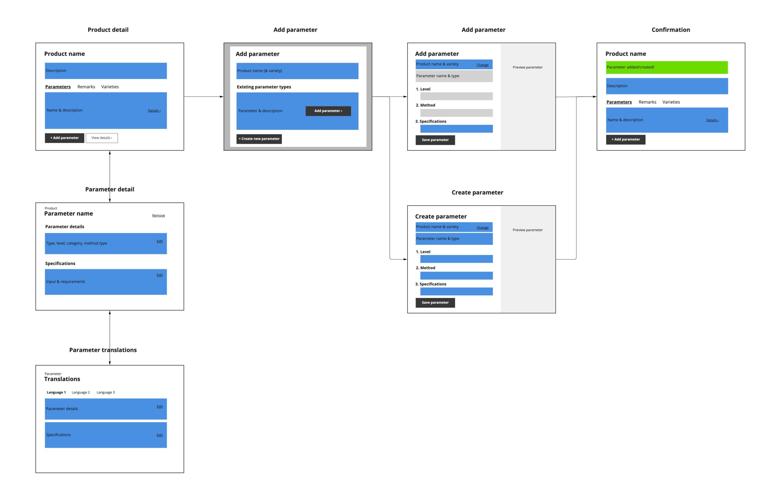
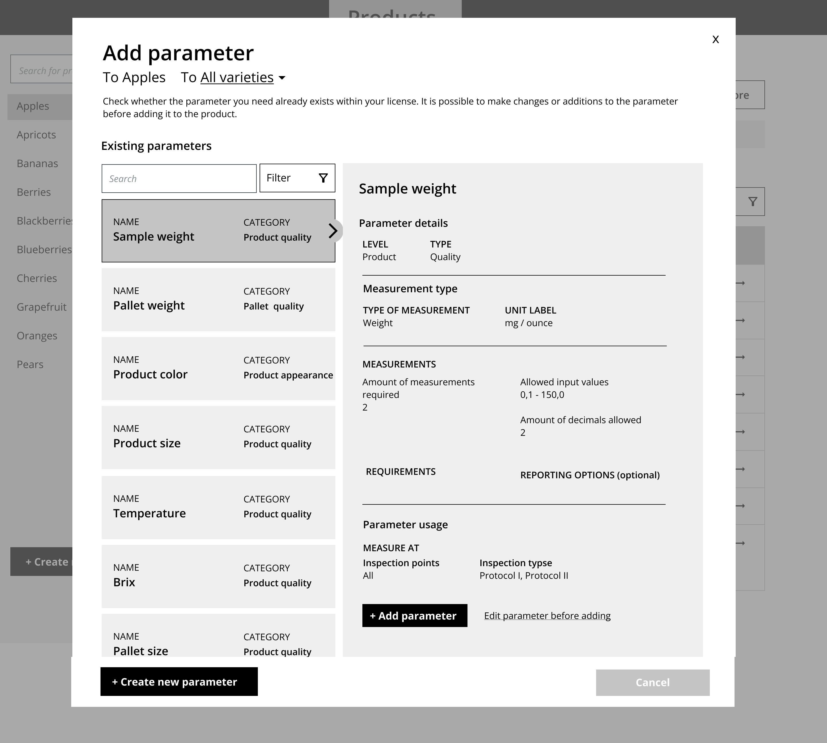
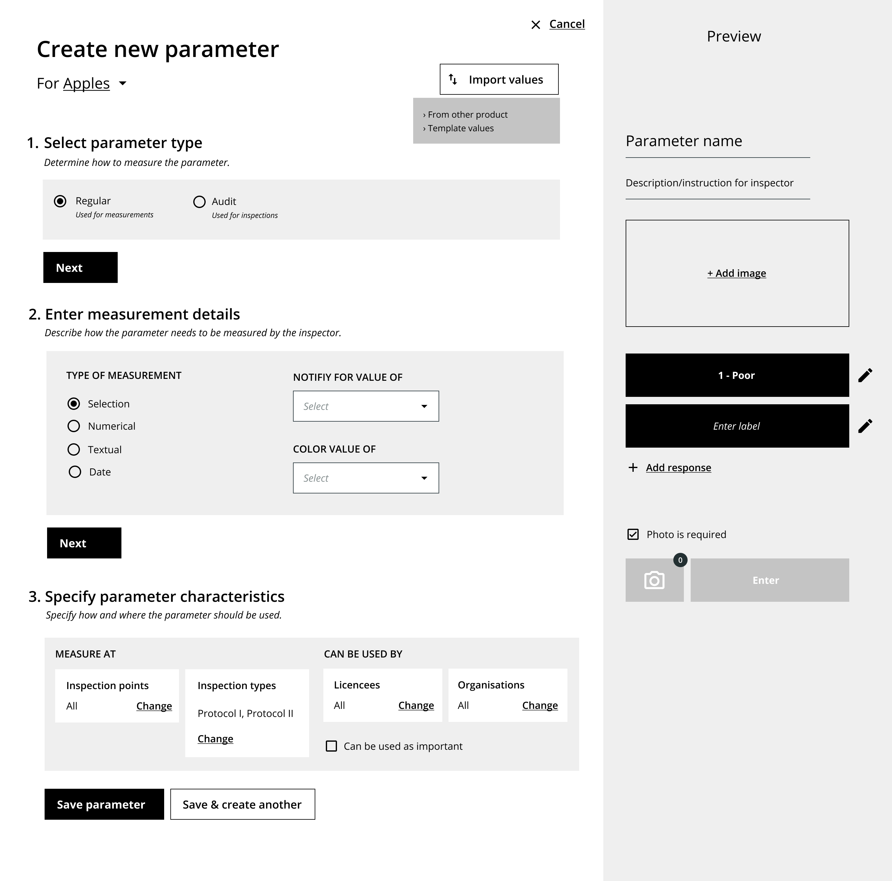
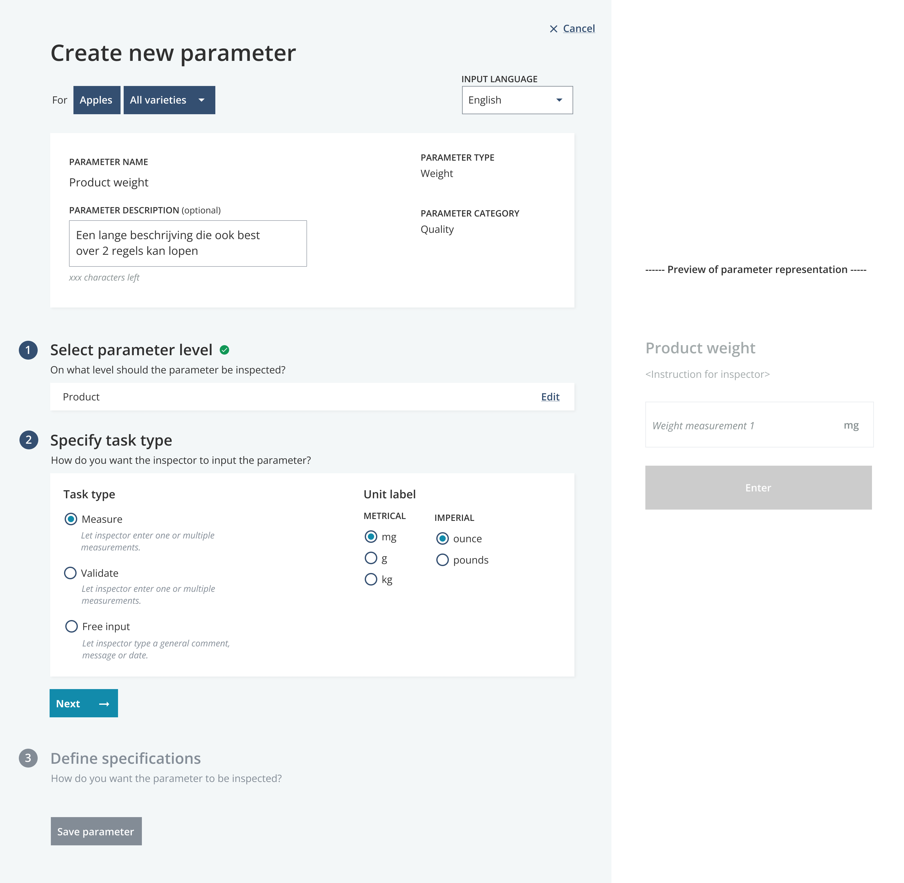
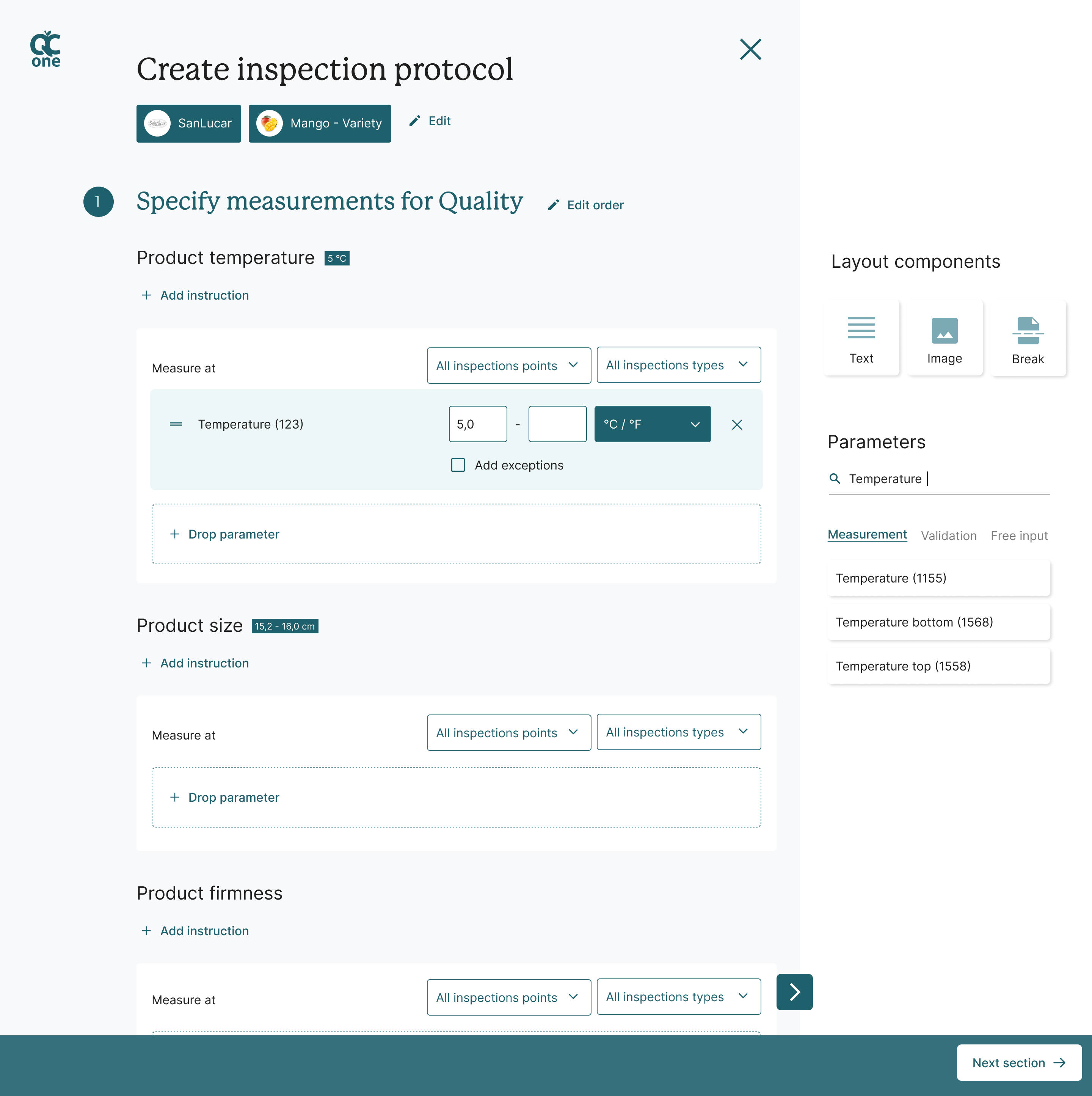
When the new system design had been explored and finalized, I worked on creating the required user flows within the system for Quality Manager to set-up their inspection proces by themselves.
The new proces allowed for a better overview and decreased the steps required to create new parameters. This will allow Administrators to more easily build up their own system.
This service prototype was validated with Quality Managers currently using the QC One application. This helped to verify our understanding, grasp their current work processes in a better way and map their mental models onto the system. By allowing these users to go into the details of the service, we actually uncovered that we had to redefine the main goal for these users. Instead of ‘easily create my own parameters’, we found their goal was more general: ‘inspect fresh produce based on pre-defined measurements to keep them up to quality standards’. Based on this insight, I redesigned the approach to better fit into the goal-oriented mindset of users.
The result
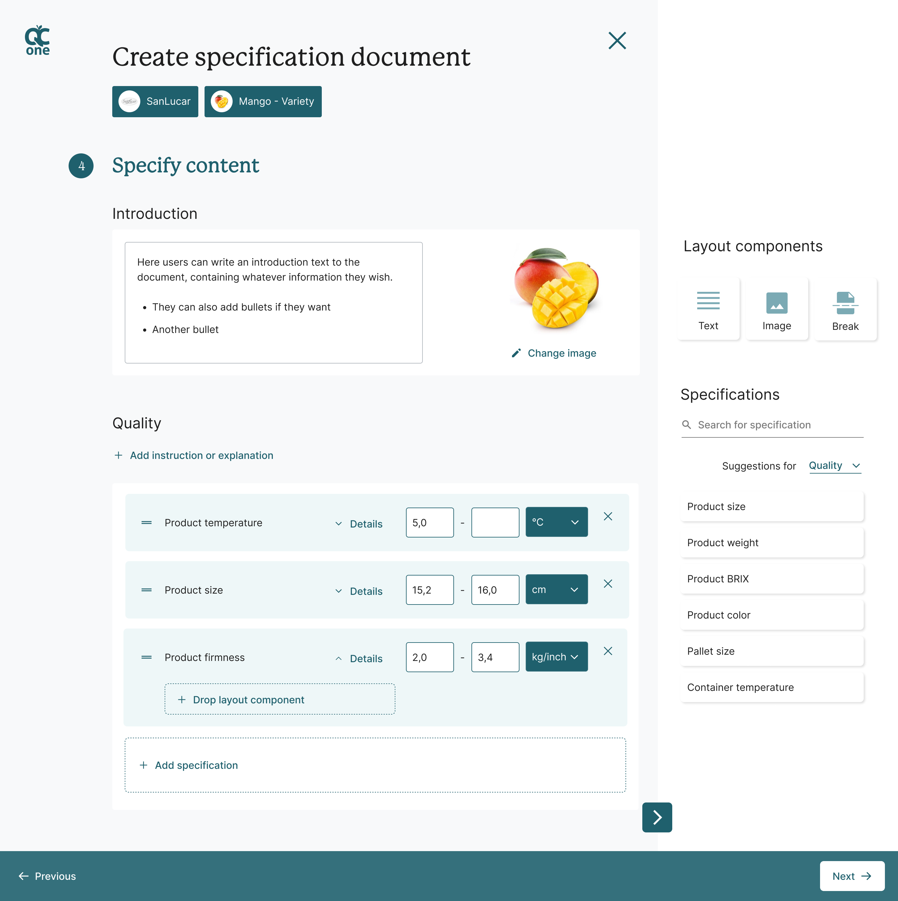
The final concept imagines a new and simplified user flow for creating parameters, allowing for more freedom for users to build their own system while keeping an overview of all important aspects. It focusses on the user’s goal, highlighting how the parameter will be used to aid the inspection process. It also provides the users with a better overview and more insights into how parameters work.
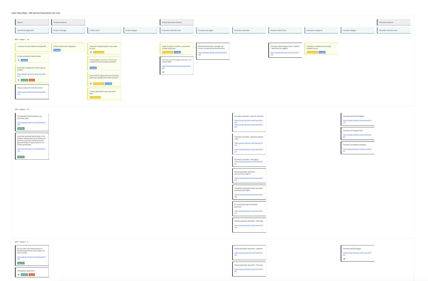
After the design process, I was also involved in realizing the concept. I aided the development team and client by functioning as a product owner during part of the project (until this role shifted to the client-side). I helped the client translate their business objectives into epics for the roadmap. Next, I translated all design effort into a user story map, that functioned as a detailed release plan. Currently this project is still in progress.
The future
After the first phase, I also dove into the other building blocks – products & specifications and inspections.
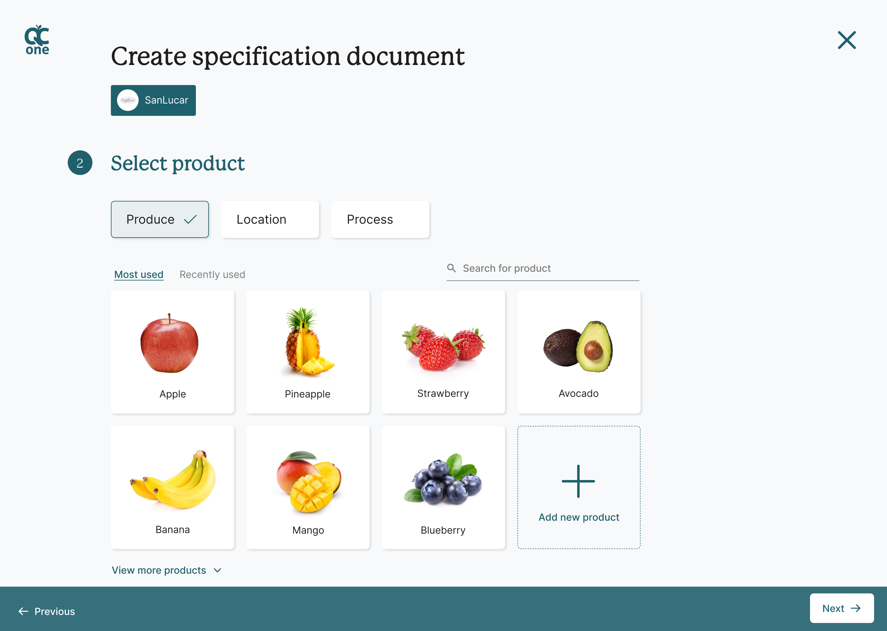
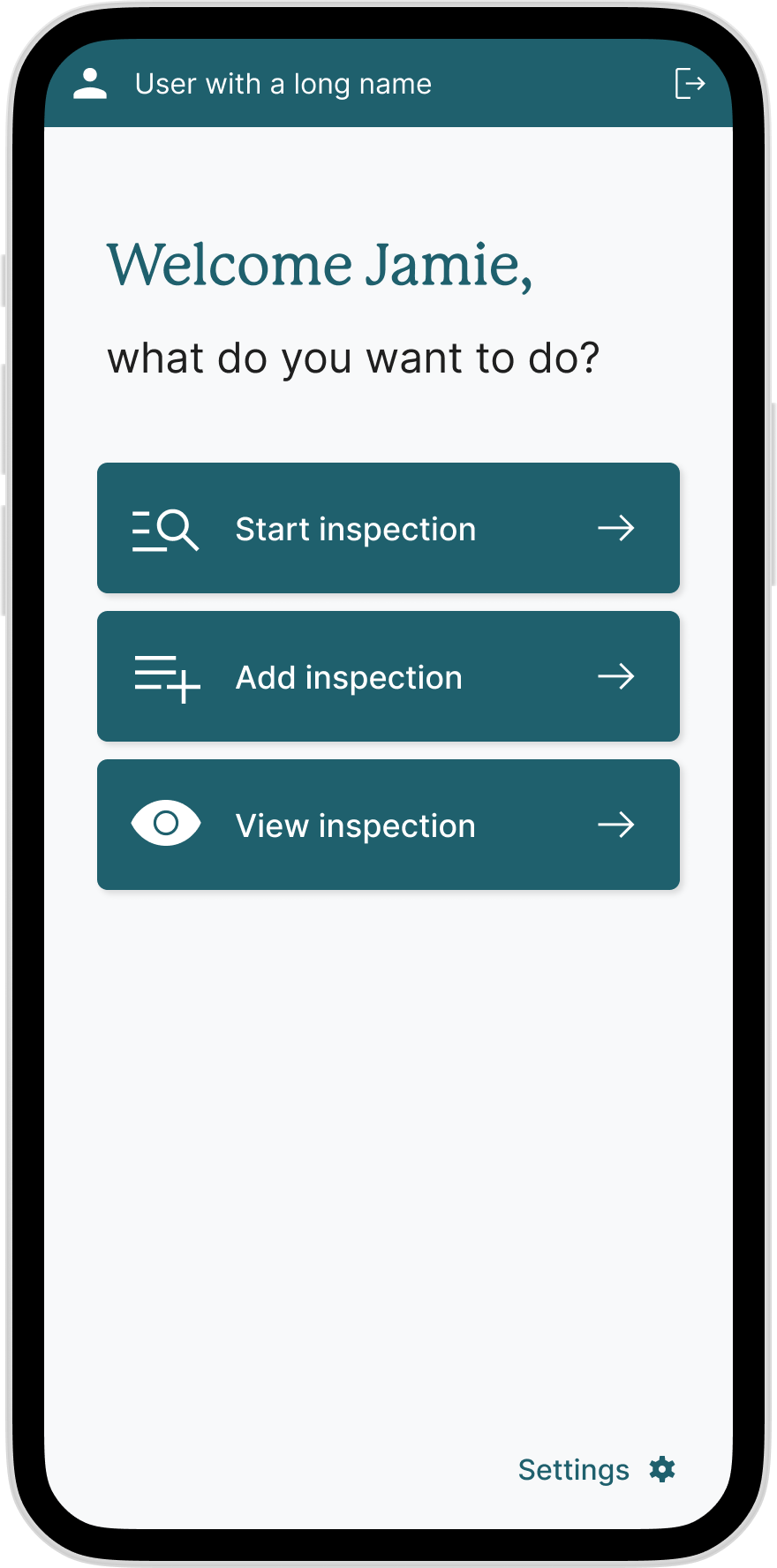
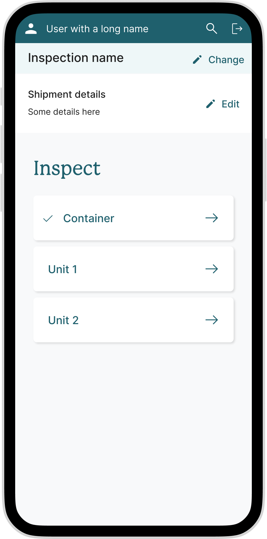
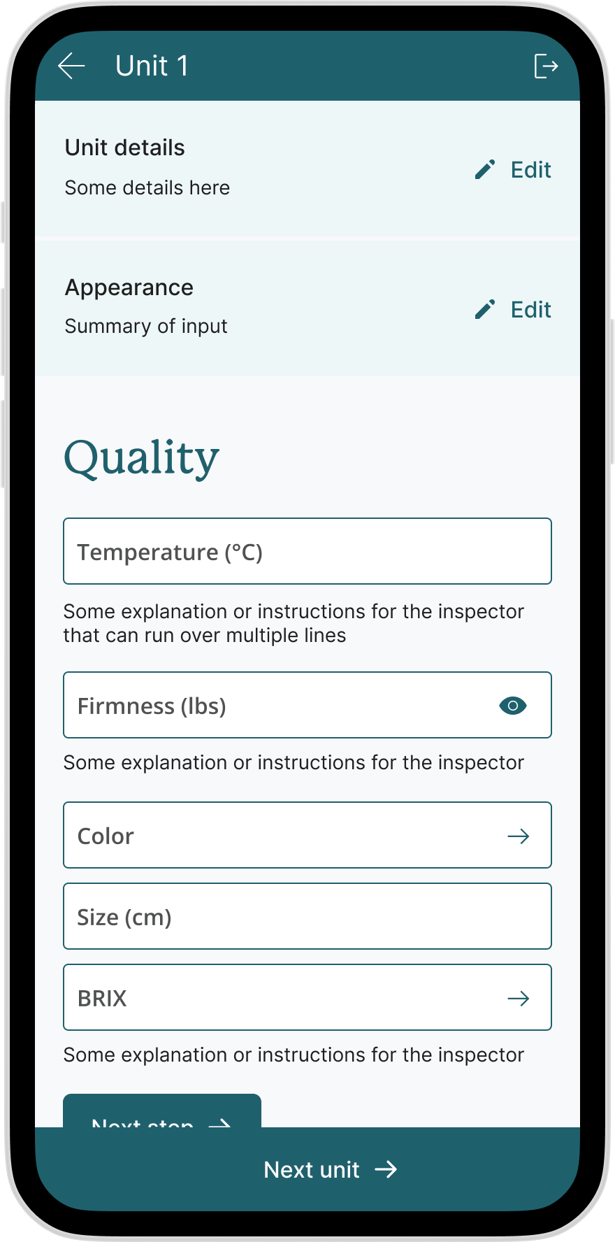
Based on new insights and a style created by a third party, I imagined what the future of the platform and service of QC One could look like. I expanded on our earlier concept and redefined the overarching user flows to create a more intuitive and straight-forward interface. This included a redesign of the app used by inspectors to record the outcome of inspections.
The goal was to provide QC One with a glimpse of the future, helping them to pitch this new idea and vision to their stakeholders.
My activities
- Service & product strategy development
- Data analysis
- Concept creation & direction
- Service & system redesign
- User experience design
- User interface design
- User research
- Facilitation of client workshops
