How design and complexity should go hand in hand
Do you ever stop to think about how exactly your phone gets charged when you plug it into the socket? If you are like me, probably not. You know it works (well, most of the time), and what you need to do to get the job done (plug in your charger). Luckily, we do not need to understand how electricity works in order to use it.
Why is the same not true for so many (digital) devices? Why is it that they often require us to ‘speak their language’ before we can actually use them efficiently?
I wrote before about the concept of Calm UX, and how many devices around us are intentionally made to grab our attention. Today I want to talk about how interacting with devices can also (unintentionally) require much more of our time and effort than we would like, and what you — as a (UX) designer — can do about it.

Setting the scene
At Sping Digital Agency, we often work with clients who are at the forefront of their respective industries. They are often in the progress of re-organising their digital services, to suit the growing pace of the market. In order to help them, we need to unravel their complex business structures and service, to present users with simple and clear information. We need to understand it, so our client’s users don’t have to.
Now this is not to say that products cannot retain some level of complexity. It is no surprise that an interface used to fly a plane is probably more complex and multi-layered than one to simply update your Facebook page. However, complex does not have to mean complicated. This is where (UX) design comes in.
“Things should be as simple as possible, but no simpler.”
— Albert Einstein

Complex vs. Complicated
Complex and complicated are often used interchangeably, but there is a very important distinction. Complexity – being the opposite of simple – refers to a problem that has many sides or angles. Or in our case, a product that has many (interconnected) levels or components — for example, a tax filing system. Complicated on the other hand refers to a high level of difficulty, indicating how hard it is to achieve a task within this product. Filing your taxes doesn’t have to be complicated if you are guided through the questions and provided with the right amount of help along the way.

Probably you‘ve heard about one of the most important design rules: “Don’t make me think”. Popularised by the identically named book by Steve Krug, it highlights that any interface (digital or physical) should aid the user and help them achieve their goals without having to contemplate the steps to get there. In other words, however complex something is, it should be easy for users to understand and make sense of it.
As (UX) designers, we cannot get around this complexity. Instead, we should dive into it, and prevent complexity from turning into complicated designs. This may seem scary, but it’s really not!
Taking action
So, how to deal with this? Here are some tips to unravel complexity that have helped me in the past, even while dealing with very complex businesses and concepts.
1. Separate business from design
I see it happen often. Business rules and processes that are translated one-on-one to platforms users interact with. This might make sense, if you are one of those people who understands every part of your (complex) business. However, for most end-users, it means they have to learn complicated business logic and relations between seemingly unrelated topics in order to complete simple tasks. Add onto this the technical jargon of both the branche and software in general, and you quickly create a system that becomes too complicated to operate by anyone except experts.
An example of this can be found in the tax world. I’ve worked on various online tax systems in the past, and most of them organise their user interface around specific tax-related concepts. An example is the ‘tax period’ (period of time for which taxes are due). Processes and interface elements all revolve around these tax periods being ‘open’, ‘closed’ or ‘overdue’.
To me — a tax noob—this term has no meaning. I don’t care about where the tax period is in the process, I care where I am. I want to know what you need from me in order for me to not get into trouble. For this reason, I once designed a tax system that translated these tax processes (‘is a tax period due?’) into user goals (‘do I need to pay something right now?’).
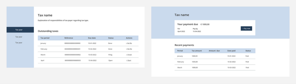
We have to keep in mind that business and software are two very separate things. It is important to understand your client’s business processes thoroughly. This allows you to map them onto a digital surface so they make sense. Hide complex concepts where possible, and only show the bits and pieces relevant to the user’s goal. This doesn’t mean dumbing down the process, but providing a simplified version of the complexity underneath.
Of course, it is also important to relate your system to real-world concepts and actions. This is where step two comes into play.
2. Use the user’s mental model
In many complex products, users are confronted with complicated terminology they are forced to learn. They often don’t relate to real-world concepts, creating unnecessary confusion. This is why it is important to talk to end-users. Not only to figure out their goals, but also to find out how they talk about their work and (work) activities. Often, this uncovers interesting inconsistencies between the real-world and the digital one, like: “This is a knob, but in the system it is called a turning wheel”. It may seem small, but each of these inconsistencies requires users to think longer and pay more attention.
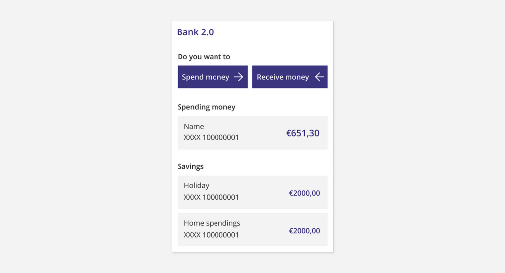
An example of this phenomenon is ‘Transferring money’ (or ‘Overboeken’ in Dutch). It is so common nowadays, that most of us don’t think twice about it. But it actually means to ‘transport money from one (digital) place to another’. This is technically what happens, but it is not what I relate to in the real-world. I think about ‘giving Simon the money’, not ‘transferring money from my wallet to theirs’. This was thus a new mental model I had to learn, on top of the real world model I already understood.

By mapping the user’s own view of the world onto the application, we can take away a lot of the perceived complexity. If users don’t have to think about an action – because it resembles their mental model – they can act faster, get a sense of calmness and feel empowered in the process. This is even more evident when actions are oriented towards the user’s real-world goal (something they are trying to achieve, such as paying their friend), instead of the system actions required to get there (for example, providing a certain input, such as defining what type of payment is required).
It is also important that all these aspects are linked and mapped in a logical way, so that it is easy to find the right actions. This is the last point on this list.
3. Map user goals in a logical way
Whether you start from an existing product or you are designing a concept from scratch, it is important to understand the building blocks for the application. What are the most important goals a user has when interacting with the system, and how does this translate to functionalities and content?
This may seem logical, but often lines start to blur and data gets dispersed. It becomes unclear where to find the right information to complete a goal, and users have to spend more time searching and moving through counter-intuitive processes. Always start with untangling the information before you start designing, so that you can cluster information based on the user’s goal and mental model.
For example, at Sping I worked for a client that offers a platform to book locations for e.g. business meetings or events. Their current platform supports one user flow — booking a location. Different user goals were combined in this flow however (finding the right location, viewing information about the location etc.). This meant the user had to start a booking in order to achieve all his other goals. This left users confused, because their path (‘book now’) did not correlate with their goal (‘find out more’).
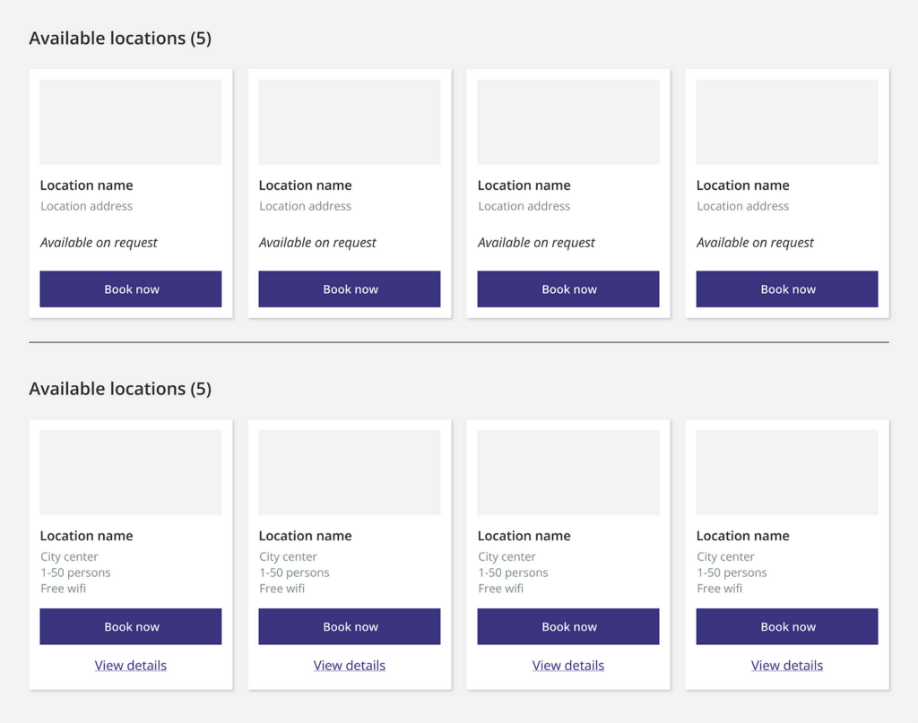
In our new design, we untangled these goals, and provided a way for the user to perform each action without impacting the other. Actions are clearly separated, and we provide just enough information for them to make a decision about where to go.
Offering less information at a time prevents users from getting overwhelmed with complexity. It allows them to focus on only one goal and orientate themselves within the system. They can follow their chosen path without being distracted by other goals, and seamlessly flow into other parts of the application only when they are ready. In other words, it makes a (complex) system easier to navigate.

So, what now?
Complexity is not something to be afraid of. In fact, diving into and unravelling complexity is one of our biggest skills as (UX) designers. It gives us the the power to present complex systems in a simple way.
“Getting comfortable with complexity will make you a better and more useful UX-er.”
— H. Locke — Medium
We as (UX) designers have to understand the complex structures and concepts underneath our client’s processes. It may take some effort, but only then can we create systems that may be complex, but are never complicated to use. Are you up for the challenge?