How Design Can Create a Calmer World; Quieting the Digital Noise
Since the dawn of man, we have relied on tools to extend our own capabilities. Things we could not manage with our bare hands, such as cracking open a nut, we were able to do with the aid of a variety of ingenious tools. Nowadays, our modern-day set of digital tools still helps us achieve what we cannot. However, these tools have evolved into something much more than functional aids. They offer advice, keep us connected and provide entertainment. Yet, at the same time they also distract us, and trick us into using them more than we need to. Really, they have taken over our lives.

Digital revolution
The majority of tools we interact with today are actually intangible; digital applications encapsulated within flat surfaces of our many devices. Natural human interactions however are not made for screens. Instead of using our well-developed tactile abilities to grasp, squeeze or lift objects, we are forced to swipe, tap and pinch on a flat screen. This behavior comes less naturally to us, and we require more time and effort to learn the required gestures. Although the digital revolution has pushed technology forward, it has also left people with no choice but to conform to the new rules and paradigms set by this technology. Technology has even evolved in such a way that it permits our tools to initiate the interaction with us, rather than the other way around. With the rise of digital tools, we no longer lead the interactions we conduct with them.
Focused attention
In the physical world, objects offer many different forms of tactile and spatial feedback that aid our interactions with them. For example, without looking at our tea cup, we can feel its weight through touching it and hence know how much force we need to pick it up. As such, we can easily combine tasks in the physical world, like drinking a cup of tea while reading. However, in the visually-oriented digital world, almost all interactions require our full and undivided attention. This leaves little mental space to perform other tasks simultaneously, especially within the visual domain. (And it’s the why you bump into obstacles when you are texting and walking on the street.) Even when we are not looking at our devices, they still scream for our attention and try to suck us into the digital world.

Attention economy
What’s worse, certain businesses have been exploiting this feature for a long time. They have found ways to use the way technology communicates with us to their advantage. By cleverly designing persuasion tactics into their products that abuse our mental models, they lure us into giving them our attention. For example, by sending us notifications that play on our quick reactions to movement and sound, they trick us into thinking something important has happened. When in fact, most of the time, nothing has. It’s just a trick to get us to use their products, so they can make money. Technology has become more of a distraction, instead of a helpful tool.
The way forward
In this digitally-oriented world, how can we design tools that are less attention-seeking? It’s easy to suggest we turn off our notifications, our devices, or simply get rid of them entirely. Instead, we as designers should re-think how people interact with the digital world. We need to design for technology that makes use of our cognitive abilities instead of abusing them. And design for technology that creates a calmer, less distracting world. Here are a few guidelines that I often use as a sanity-check when designing.

Help people decide
Life is stressful enough already. Technology should exist to help and inform people in a calm way, instead of agitating them.
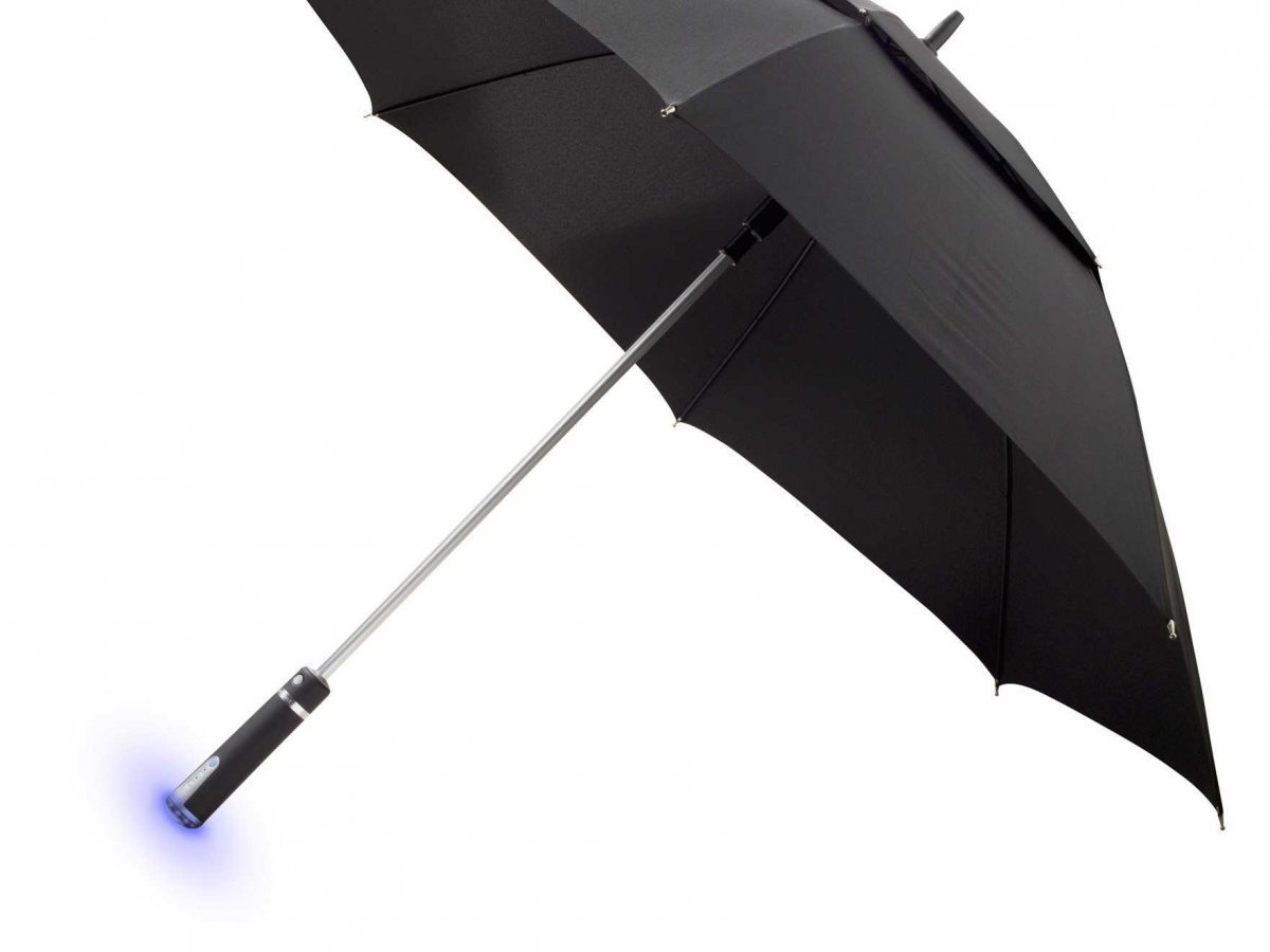
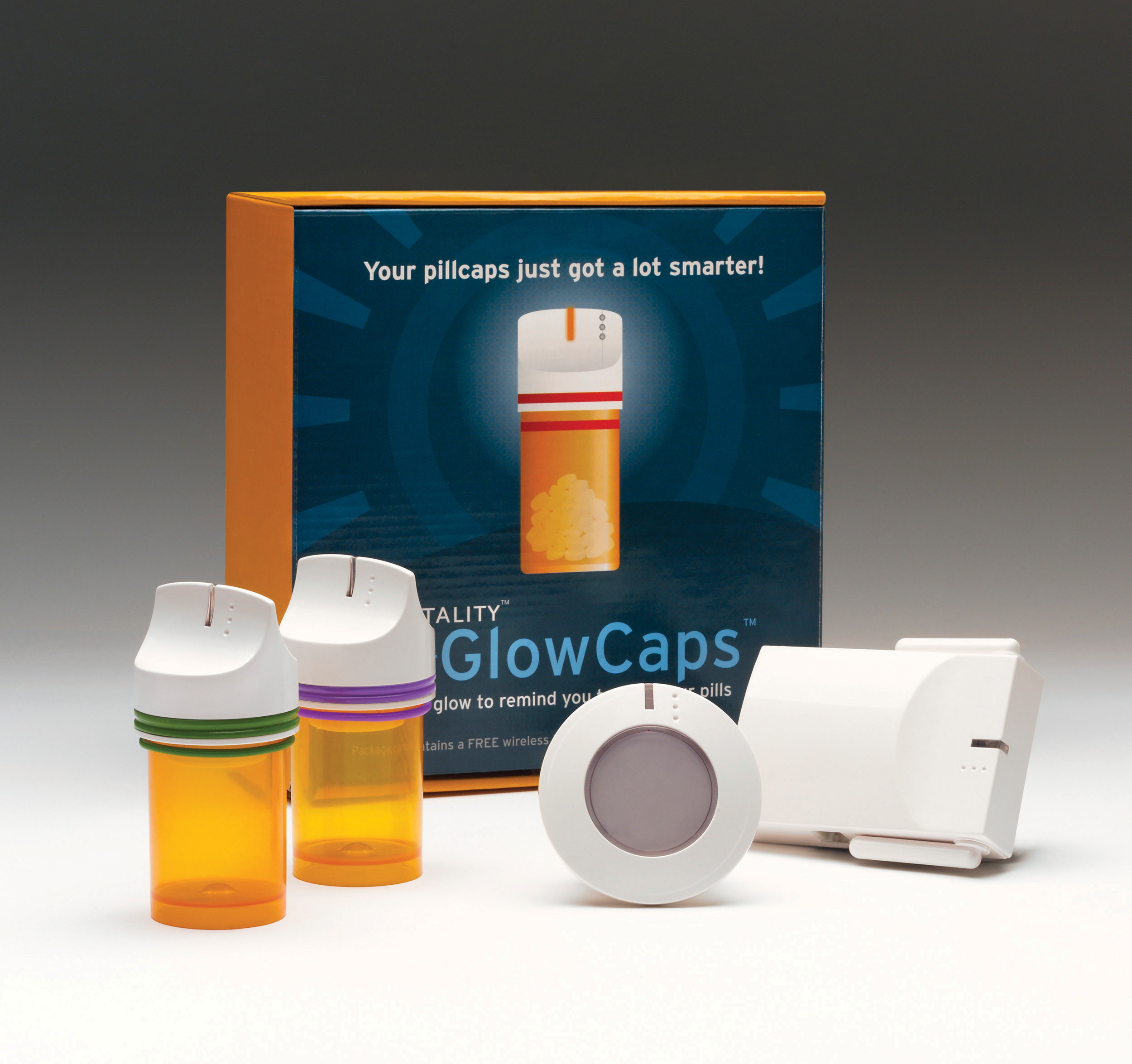
Your product is not the most important thing in a user’s life, nor should it try to be. So, instead of screaming at people, it should try to remain in the background if not needed. Use soft alerts (such as nudges) or other cues that people are able to interpret without the need to focus their attention on it. Only when something is really (and I mean REALLY) important and can potentially affect the user, should your product step out of the background and provide a more urgent signal. We should show people that they can rely on technology to help them decide when to take action, and when to relax.
Help people understand
Processing information requires a lot of attention. Design should provide the least amount of information required for people to understand.
Design for ‘just-enough’ information. As designers, we need to help people make sense of the relevant information we have for them. Show you value people’s time, and offer only the data they really need at that moment. Provide the information in a clear, understandable way, using human language instead of complicated jargon. Including additional cues such as color or icons will help people process the information more easily. And only if they choose to, allow them to dig deeper into the details. We should help people understand what is going on in the quickest way possible, so they can take act immediately (or decide not to).
Help people act
People have a lot of other things going on. Technology should facilitate for quick and easy interactions, so they can get back to their lives.
Help people get things done, fast. Learn from their actions, remember them and create useful shortcuts based on their preferences. If I set my alarm clock to 7AM every day, don’t offer me pre-sets that only offer the 9AM option! Learn from my behavior and change the pre-sets. Also, design interactions that mirror actions in the physical world. Make use of tactile or spatial feedback rather than relying only on visual confirmations. Or make use of actual physical behavior to allow people to interact with your product, for example by using gesture commands. We need to bring the digital world back into the physical one, to let technology fit more seamlessly into people’s lives.
What’s next?
At this very moment, many new technologies are emerging. Smartphones as we know them may be gone in the next five to ten years, so what will be the next big thing? Will we all be wearing AR contact lenses? Whatever this new technology will be, we as designers need to keep these principles in mind when developing them. Let’s use the power of new technologies to design interactions that more closely resemble human abilities. That help the technology fit into the lives of busy people, instead of distracting them from it. Design should not be ‘mobile-first’ or even ‘AI-first’, it should be ‘human-first.’
You can also read this blog on Medium.